Visit our weekly changelog for a list of all the latest tweaks and fixes.
Sync all-day tasks to Google Calendar too: Nov 27
Now you can sync your all-day Todoist tasks to Google Calendar too, giving you an even more complete view of your daily agenda.
After hearing your valuable feedback and ideas (keep ‘em coming!), we knew it was time to make this happen for all the GCal aficionados out there. Syncing all-day tasks is now an option in our Calendar integration, letting you choose whether to view all your scheduled tasks or just your time-blocked ones.
Here’s Heather for a lightning-fast walkthrough on how to set it up:
Syncing made easy
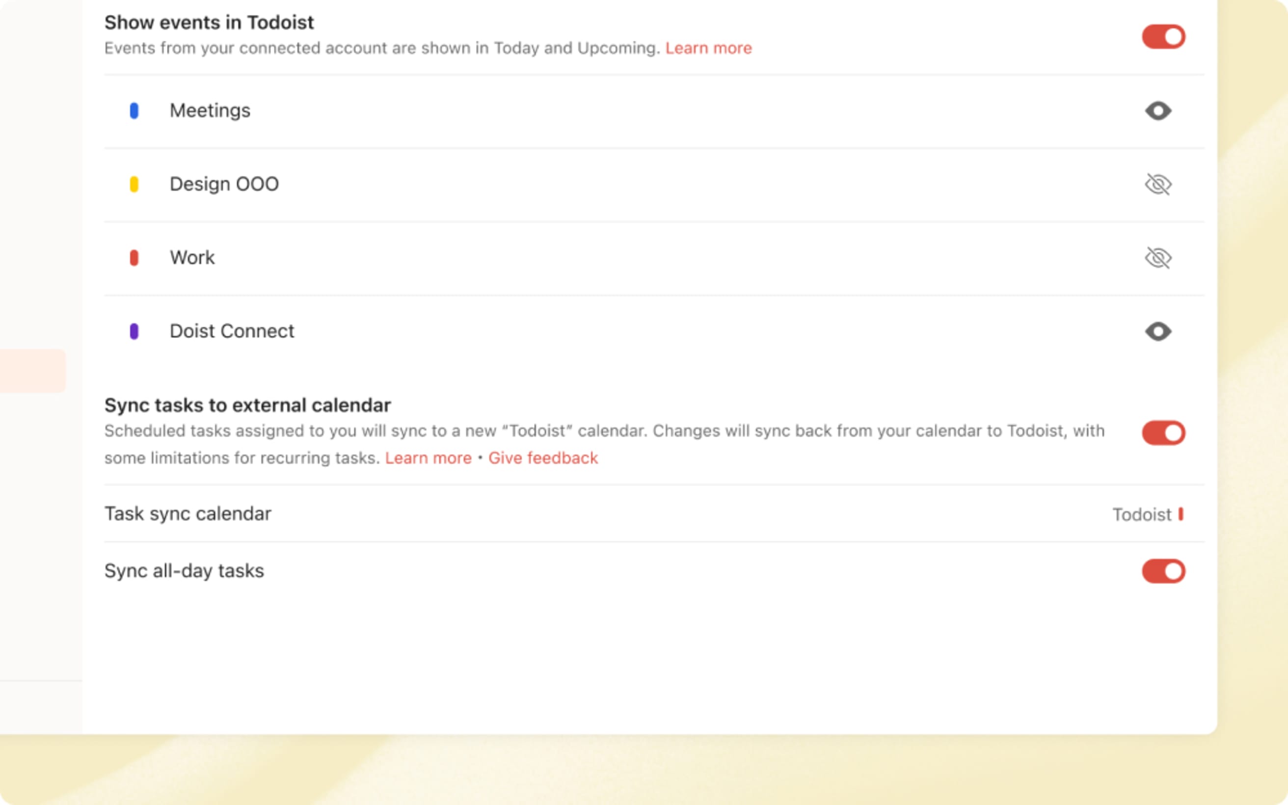
To give it a whirl, head over to the Calendar integration in Calendar settings. Make sure you’ve enabled the Sync tasks to calendar feature and then toggle on the new Sync all-day tasks option. In just a few seconds, your assigned tasks with just a date will also show up in the “Todoist” calendar in your Google Calendar account.
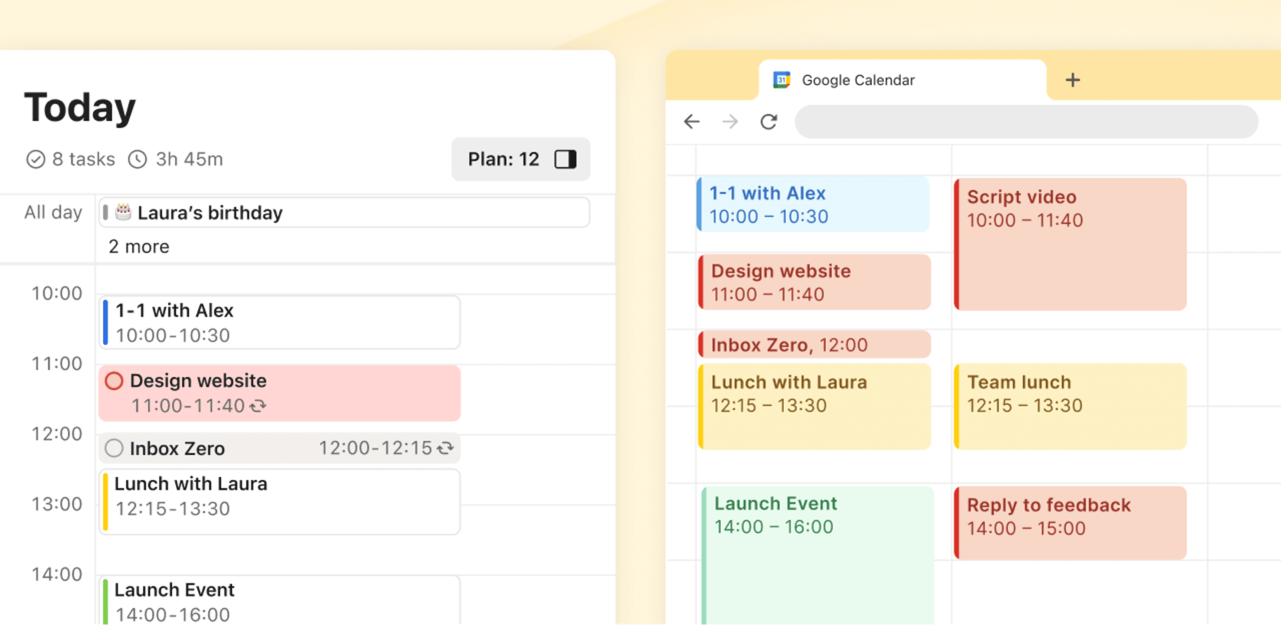
By having your all-day tasks in Google Calendar, you can time-block your day without needing to switch apps. Easily slot in time to complete that report before your team meeting, and see your updated schedule sync back to Todoist in no time.
If you ever find yourself a bit overwhelmed by the display of your all-day tasks, you can disable this option anytime from Calendar settings.
Note
Similar to time-blocked tasks, completing an all-day task will add a ✔︎ checkmark in Google Calendar. Rescheduling or renaming from Google Calendar will sync back to Todoist. Here’s everything you need to know about the Calendar integration.
Sync scheduled Todoist tasks to your Google Calendar: Oct 29
Manage your time-blocked Todoist to-dos like Review client proposals at 2pm for 2h or Pick up Garfield from the vet at 10am for 30m more efficiently by syncing those tasks directly to your Google Calendar – available on all plans!
Your to-dos and events all in one place
Now, you’ll be able to see your Todoist tasks right in line with your dentist appointments, board meetings, game nights, and whatever other fun things you’ve got going on. This’ll help you make realistic plans and avoid overcommitting yourself (music to all our adulting ears, right?).
Let Francesca show you how to start syncing:
How it works
Syncing tasks to Google Calendar is incredibly easy to set up (easier than, say, coaxing Garfield into the car for his vet appointment).
- If you haven’t done so already, first head to Calendar settings to connect Todoist to your Google Calendar account. Click Connect Google Calendar and follow the flow.
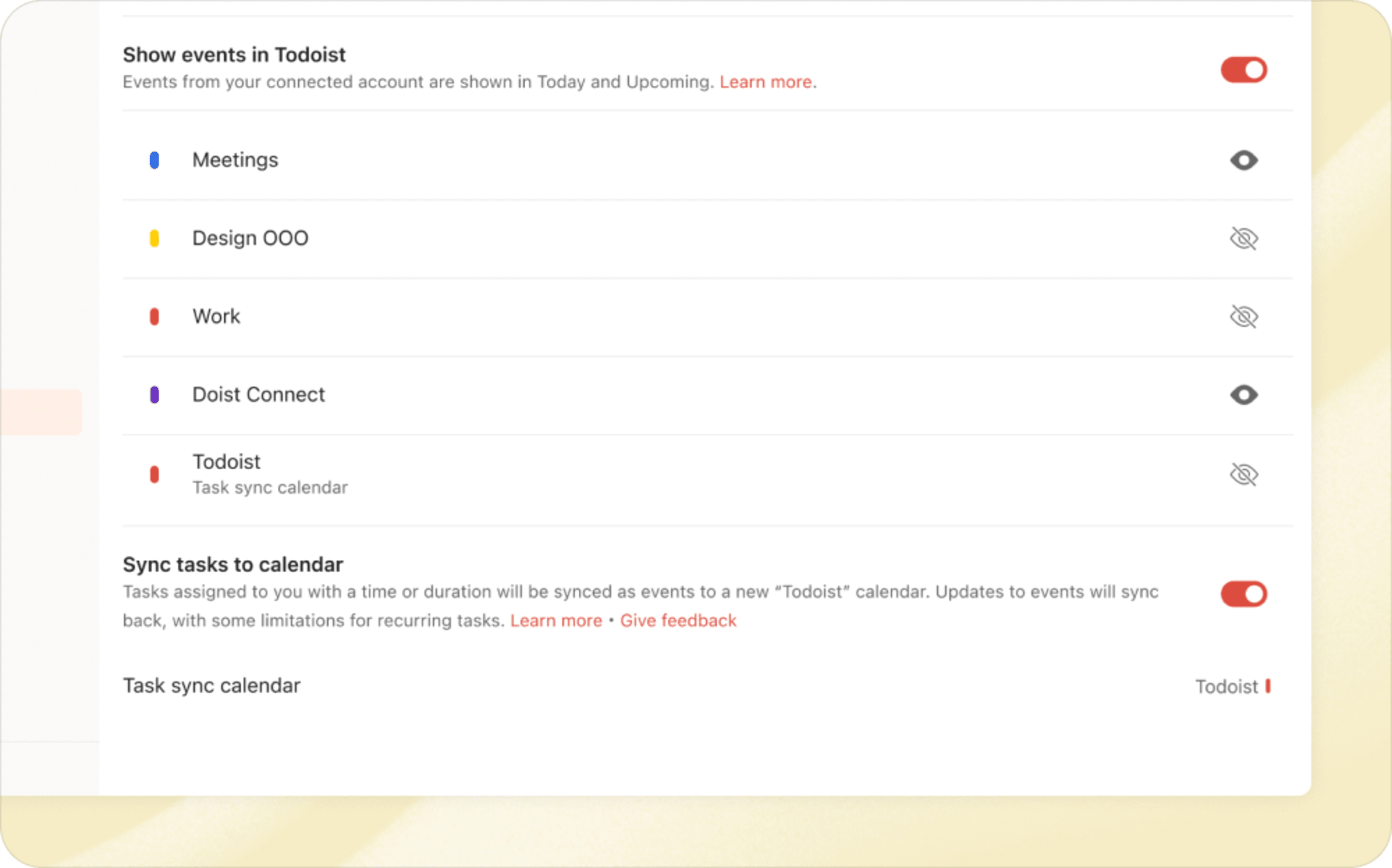
- Once you’re connected to Google Calendar, flip the toggle at the bottom of Calendar settings to enable the Sync tasks to calendar option.
- Within seconds, you’ll see a “Todoist” calendar appear in your Google Calendar account.
With the Sync tasks to calendar feature turned on, Todoist will automatically sync all your tasks with a due date and time or duration to Google Calendar, including scheduled tasks in shared projects that have been assigned to you. And when plans change – as they inevitably do – you can conveniently reschedule your tasks directly from Google Calendar, saving you from unnecessary app hopping.
Check out our help center article for more details on syncing Todoist with Google Calendar. (Or, watch Francesca's demo – she explains it thoroughly halfway through.)
Francesca · Frontend development
Once a task has been completed, watch it transform in your calendar with a charming ✓ check mark. It’s a satisfying way to see your accomplishments at a glance!
What’s next? (Hint: It starts with O and ends with look) 👀
Our journey with calendars doesn’t stop with Google.
You guessed it – we’re diligently working on a new Outlook Calendar integration that’ll bring the joy of time-blocking to all you Outlook enthusiasts. We’ll also be exploring ways to display completed tasks within the calendar layout in Todoist, so you can easily track your achievements over time.
In the meantime, let us know what you think of the new Sync tasks feature. We’d love to hear from you as we continue to refine the calendar experience in Todoist.
Multi-window and Float on Top for desktop: Oct 15
You’re in the zone. You’re nailing it. You’re a productivity supernova, crushing this task and making… Wait. Where did that window go? What was I working on? Fade to black.
Being yanked from your flow by something as innocent as window management is what we’d call “not fun”.
Multi-window support is ready for action on our desktop apps. And, along with it, a delectable Float on Top option to keep your most important window right where it needs to be - in focus.
- Have multiple Todoist windows open at once, to cross-reference your tasks and projects without losing your place.
- Sync edits between windows instantly (even offline 💪).
- Set a default Home view to open your go-to project, view, label or filter in new windows.
- Use Float on Top to keep your current task or checklist visible above the 17461 other things you have open. 🔦
Here’s Seva to explain how it works: 👇
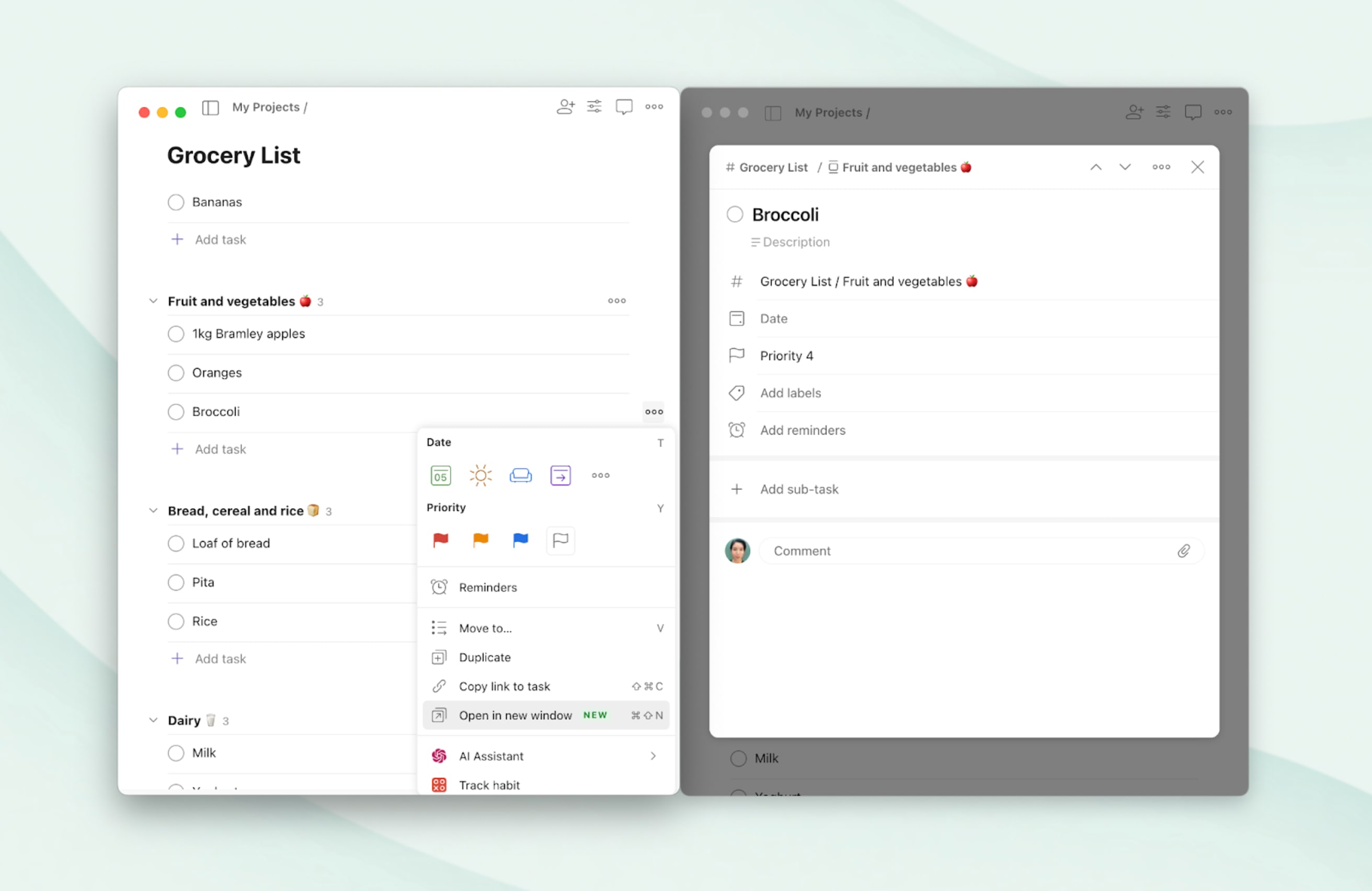
To try it out, click on the three dots icon beside any project in the sidebar and select Open in new window. Alternatively, open any view or task, click on the three dots icon and select Open in new window. You can also use the keyboard shortcuts Cmd ⌘ + Shift + N (Mac) or Ctrl + Shift + N (Windows) to open this view or task in a new window.
Quick tip
To change your Home view, go to the General > Settings > Home view and select your preferred option. From there you can pick from standard views (like Today or Upcoming) as well as any project, filter or label.
Lastly, you can float any Todoist window on top of all the rest to keep it visible at all times. Select Window > Float on Top in the menu bar, or use option ⌥ + Cmd ⌘ + F (Mac) or Ctrl + F11 (Windows). No more searching for your Todoist window in a sea of running applications. 💆
Reminders: Effortlessly remember everything: Sep 19
For many of us, September is the epitome of busyness. But keeping up with your to-do list during these hectic times doesn’t have to be a headache. 💆
Behold (...dramatic pause) ✨Reminders✨ (cue oohs and ahhs 😲)
Reminders, now free for everyone
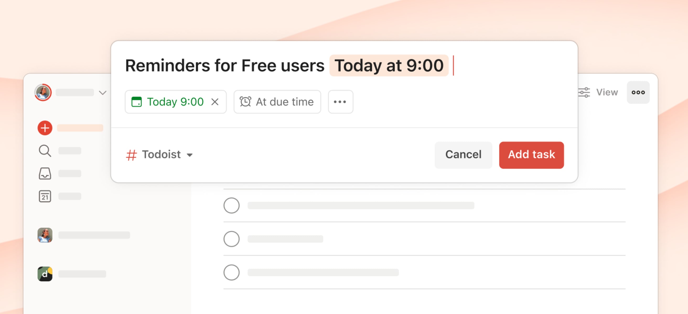
Reminders are a gentle nudge that resurfaces a task to keep you on track. When you set a due time for a task – like “Write the report at 10am” – Todoist will automatically set a reminder for you. You’ll receive a notification when the task is due.
Here’s a short demo from Jon on how they work 👇
Getting started really is as easy as creating a task and assigning it a due date and time. Try it now:
- Open Todoist
- Add a time-sensitive task that’s been taking up precious headspace (like “Submit my expenses tomorrow at 9am”, or “Call Susan on Tues at 4pm”).
- Move on with your day, and rest easy knowing you’ll be reminded when the time is right. 🧘♂️
Quick tip
Automatic reminders can be sent via push notification, desktop notification, or email. By default you’ll receive push and desktop notifications. Adjust this (and more) by heading to Settings > Reminders wherever you use Todoist.
More memory joggers
Getting notified when a task’s due time rolls around is a powerful thing. Here are three other automated tools in your Todoist toolbox that can also make remembering tasks feel effortless:
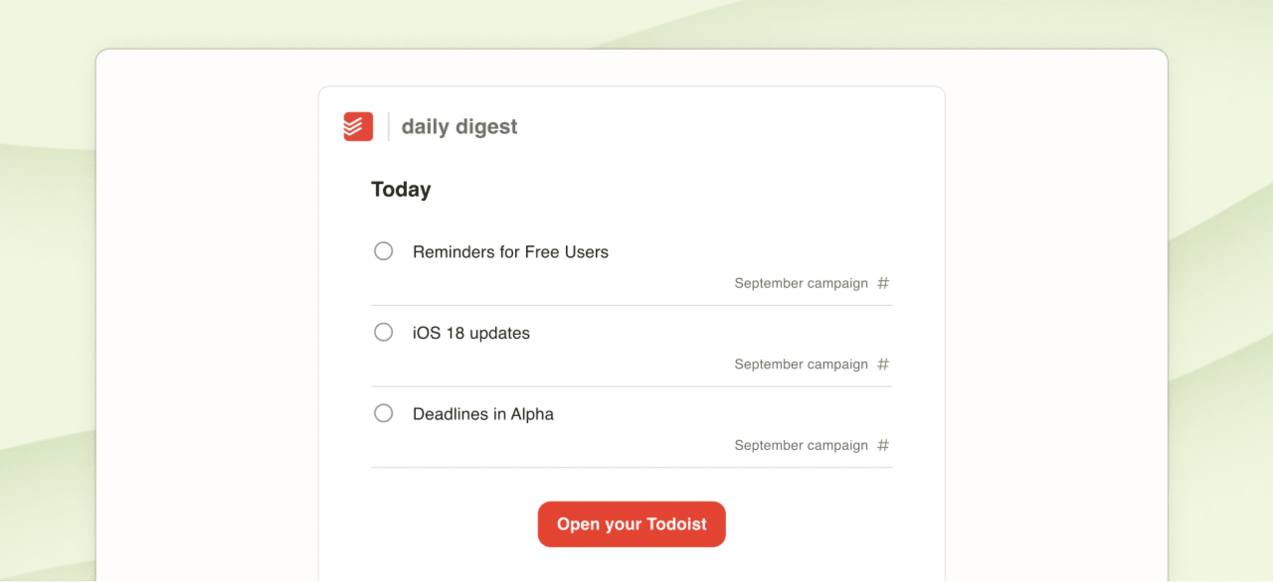
- Start the day with a Daily Digest email every morning with personalized productivity stats plus your tasks for today. Enable it via Settings > Notifications on the web or desktop apps.
- Get a nudge to organize your tasks for the day with a Morning Overview notification sent to your phone. Switch it on and customize the timing in the mobile app’s Notifications settings.
- Make sure nothing’s slipped through the cracks with an Evening Review mobile notification. Another customizable, timely prompt that keeps you feeling on top of it all. 👑
Reminding like a Pro
Upgrading to a paid plan (Pro or Business) unlocks so many more ways to make reminders work exactly how you need:
- Adjust how long an automatic reminder is sent before a task so you get the perfect amount of notice every time.
- Add multiple reminders to a single task when it needs that extra bit of attention-grabbing (like remembering a dentist appointment 😬).
- Use location-based reminders to get nudged about a task when you leave or arrive at a specific place, like heading to the office or arriving at the grocery store.
- In addition to adding a reminder when a task is due, users on paid plans can create custom reminders for specific times (“in 5 days”) or even make them recurring (“every Monday at 9am”).
- Use the shortcut “!” when creating or editing a task to quickly add a reminder as you type (“!30mb” or "!30min before").
Check out a quick tour of Pro Reminders by Heather. 🍿
Free Reminders, finally
For over a decade, Reminders have been a cornerstone of our paid plans. But as a company we’ve been building momentum and improving the health of our business (we don’t have billion-dollar investors and are fully bootstrapped, after all!).
It’s because of your continued support that we can make basic Reminders available on all plans, for free. And we thank you for it! 🙏
Plan your day with Calendar layout in Today: Aug 28
Let’s talk about something we all know too well: the overfilled week. It’s easy to get carried away, cramming our schedules with ambitious plans and endless to-dos. Before we know it, our week looks like an overstuffed suitcase bursting at the seams.
To break that daunting week down into manageable, bite-sized pieces, many of us turn to the Today view – and focus on just one day at a time.
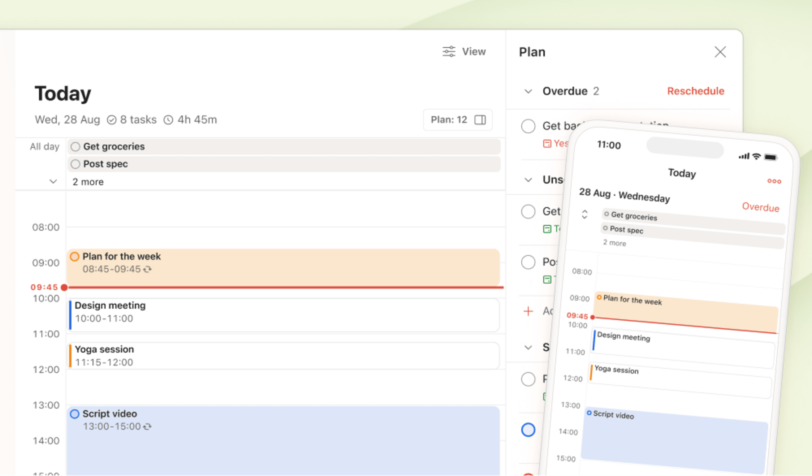
And now, with the rollout of the calendar layout in the Today view, it’s going to be even easier to put together an attainable plan for the day. Whether it’s blocking time to finish a big project, rescheduling tasks due to an unexpected meeting, or simply finding time to breathe. Seeing your daily schedule in a calendar layout helps you keep your eyes on the prize – today’s prize.
Take a closer look at the calendar layout in Today in this walkthrough from Denise, our Product Marketer:
How it works
To switch to the new layout on web and desktop, head to Today, open the View options menu, and select Calendar.
You’ll now see today’s tasks in a 1-day calendar layout – perfect for planning your day and time-blocking tasks without getting distracted by the rest of your week. And, if you’ve set up our new Calendar integration, you’ll be able to visualize your day’s workload and Google Calendar events all in one view.
Plan your day
Calendar in Today is the perfect tool for creating a concrete schedule that outlines what you’ll work on and when. Click and drag to add a new time-blocked task. Rearrange tasks by dragging them to different time slots. Adjust the time you’ll spend on them by dragging out the edges of a task.
On web and desktop, you’ll also see the shiny new Plan sidebar in Today’s calendar layout, making it even more convenient and powerful for scheduling and rescheduling your day.
Click on Plan at the top-right to open the panel. You’ll see a list of all your tasks for the day so you can quickly put together – and adjust – your plans. Simply drag tasks right into the calendar to fit them into your schedule. Tasks are organized into three groups:
- Overdue: all your overdue tasks
- Unscheduled: all tasks due today without a set time (which you’ll also see in the All day section above the calendar)
- Scheduled: today’s tasks that already have times assigned to them
Planning your day on the go
Users of Todoist for iOS and Android will be happy to hear that the layout has also been rolled out on mobile. The calendar in Today is the perfect view to keep an eye on your plans and ensure you stay on track throughout the day.
You can add new tasks with a tap, or quickly rearrange your schedule by dragging and dropping tasks in the timeline. To adjust the duration, tap a task to open and edit the details.
Tasks that don’t have a time assigned to them can be found in the All day section at the top. To take a look at the full list of all-day tasks, tap the arrows or [x] more button to expand the section. From there, you can easily drag tasks to the calendar to fit them into your schedule of the day. Or, drag time-blocked tasks back to the All day section to remove their due times.
If you have overdue tasks, you’ll see Overdue at the top-right. Tap on it to pull up the list so you can reschedule tasks.
Having the calendar layout in the Today view is an addition we know many of you have been eagerly (and patiently 🙏) waiting for. Be sure to let us know what you think of the new layout.
We hope it’ll help you stay present, avoid multitasking pitfalls, and conquer your tasks – one day at a time. Because when today is under control, the rest of the week falls into place naturally.
Share templates with your team: Aug 22
Whether you’re collaborating with others or working solo, a good template can give you a huge head start on your next project. In our last update, we covered the ins and outs of creating and managing your personal library of go-to templates.
Today, we’re talking collaboration. 🤝
If you work with a team, you can now share those carefully crafted templates with your entire workspace in Todoist!
A shared gallery
You might be wondering: what does “sharing templates” mean? Well, that’s an excellent question. And you’re in the right place.
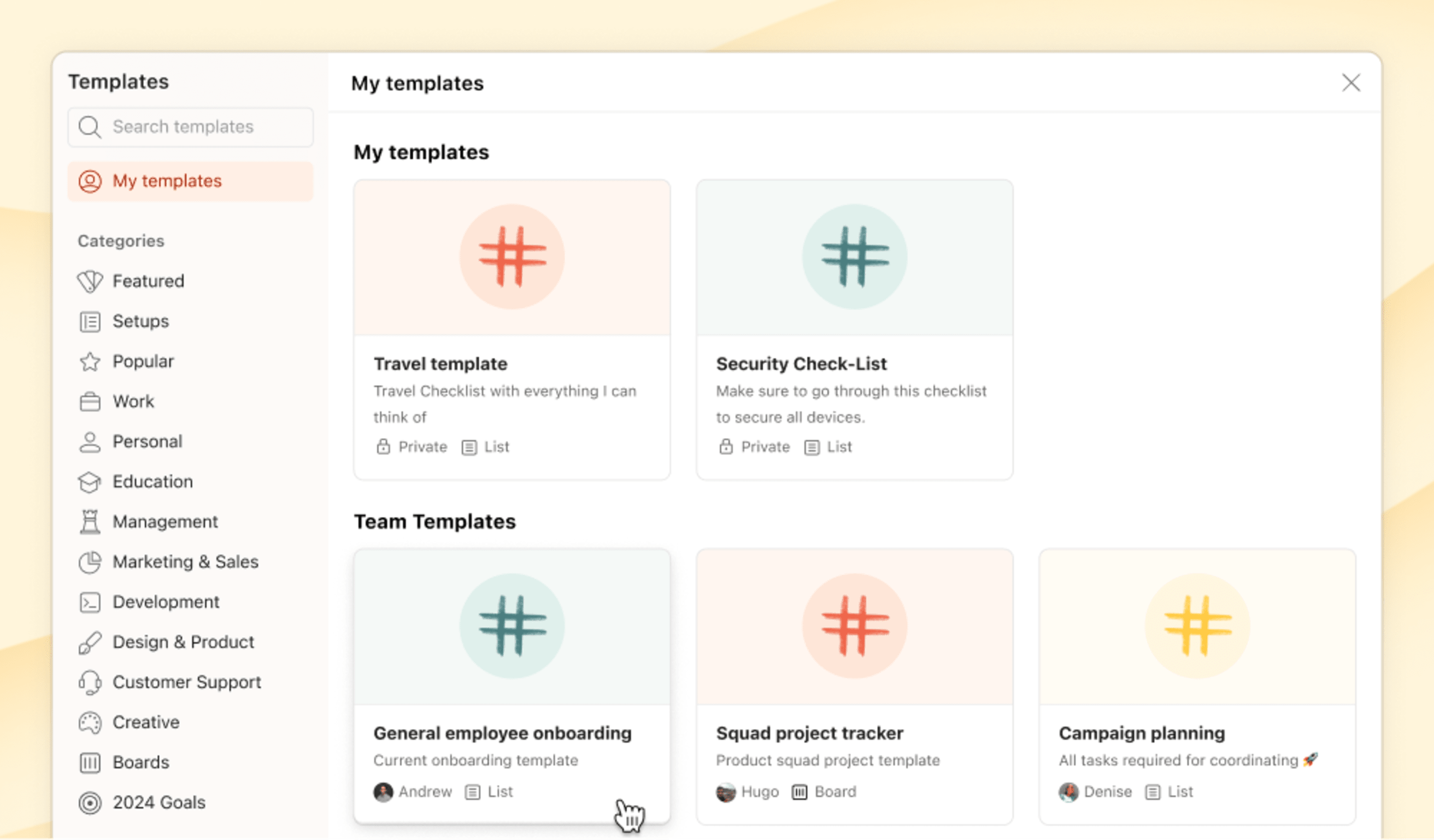
Templates in Todoist live in the templates gallery. So far, the gallery has been where you’ll find a selection of templates from us (👋), and any templates you’ve created yourself (👏). Now, in the My Templates tab, you’ll also see templates for workspaces you’re a part of (🙌).
Templates for your workspace can be either private (only visible to you), or shared and accessible by everyone on the team. Shared templates allow anyone on the team to create a new project in the workspace. Easy peasy.
There are two ways to add templates to your team’s gallery:
Share a personal template with your team
Your personal templates will be listed under the My templates section. Open your game-changing-wonder-template and click the share icon at the top-right of the screen. From here you can give everyone in your workspace(s) access to it and then use the Copy link button to share the template directly with a teammate.
Add a new workspace template
The other way to add new templates to your team’s library is to convert an existing project in the workspace. Much like your Personal Projects, you can convert any existing project into a template by clicking the three dots icon. Select Save as template from the menu, add a few details, save it, and away you go.
When you add a template this way it will be set to private and only be visible to the author. To make it available to your whole team, use the share icon to tweak the access level.
Quick tip
When you create a template that includes tasks assigned to teammates, those assignments will carry over when you use the template. To keep tasks assigned to the same people, make sure to add these folks to the shared project before importing the template.
Teamwork makes the dream work
Working from a shared set of templates has a lot of upsides when you’re collaborating, of course. A ready-to-use plan at the fingertips makes it easier for your team to get new projects off the ground and brings consistency to the way you work together.
- Setting up a new team meeting? Use a meeting template to keep the format consistent.
- Onboarding a new colleague? Cover all your bases with a template onboarding checklist.
- Launching a new product? Use a custom launch template to keep admin to a minimum.
Get templatizing
Template sharing is available to all workspace users and we’re excited to hear what you think! Let us know how your team gets on and how using templates impacts the way you work. ✌️
Save time & effort with custom templates that work for you: July 12
Do you ever find yourself creating the same projects over and over again? What if you could skip the hassle of setting them up every time?
You can now create, save, and manage your own templates directly in Todoist. It’ll make it much easier to reuse what you’ve perfected. You can have all your recurring projects ready to use – like those meticulously crafted checklists, your trusted project tracker, and that go-to BBQ prep list.
Here’s Denise from the Marketing team to show you how easy it is to set up custom templates:
Looking for inspiration?
Not sure where to start? Here are some clever examples of how the Todoist team uses custom templates.
- Whenever Omar goes on a trip, he grabs his trusty packing list to make packing stress-free and fun, setting a positive tone for his travels.
- In keeping with the travel theme, Ana created a comprehensive travel checklist with everything she can think of – what to pack and things to do before, during, and after the trip (including a final task to “add anything that was missing in the template”).
- Denise uses her campaign planning template to add predefined tasks to an existing project whenever we’re gearing up to launch a new feature. Using the same format ensures nothing gets overlooked, and keeps the team organized and on track.
Browse the templates gallery for more ideas on what you could turn into your own customized template.
How to create your own templates
- Begin by opening the project you want to templatize.
- Select the three dots icon in the top-right and select Save as template.
- Write a description and, optionally, change the template’s name and color. If you’re on iOS, tap Next to edit these details.
- When you’re ready, hit Save.
- If you’re on Android, tapping Save as template will directly add your project as a template to the gallery. Navigate to the template in the gallery to edit its name, color, and description.
All your custom templates will be neatly organized in the new My Templates section of the templates gallery. Use them to create new projects or add your template as tasks to an existing project.
Quick tip
Select Browse templates at the bottom of your sidebar for quick access to the templates gallery. If you prefer not to see this button, go to Settings > Sidebar to hide it.
Add your template to a new or existing project
- To create a new project from one of your templates, head to the My Templates section in the templates gallery. Choose a template and select Copy to My Projects to set up your new project.
- If you want to add tasks from a template to an existing project, go to the project, select the three dots icon, and select Apply my template. Then, choose the template you want to copy tasks from, and you’re all set. (On Android, select the three dots icon, then tap Browse templates to choose the template you want to copy tasks from.)
Rain · Product team
We get asked about task templates fairly often. Here’s a tip: create a custom template with just one task ... and it’s basically a task template that you can easily add to any of your existing projects.
Creating your own templates in Todoist has been highly requested by many of you, and we’re thrilled to finally get it into your hands. With room for up to 100 templates, you’ll have plenty of space to keep all your important workflows at your fingertips. Let us know what you think!
Up next: custom templates for teams
Hang tight, teams – we’re not done yet! We’re just as eager as you are to use custom templates with our team. Soon, you’ll be able to save time and effort by sharing workflows with all your teammates. With all your shared templates in one easy-to-access place, it’ll be a lot easier to kick off team projects quickly and consistently.
Keep up with your team’s activity in a team workspace: July 9
We launched team workspaces so you can easily separate work and life in Todoist and have a better way to collaborate on team projects and tasks.
Since then, more than 100,000 people like you have tried our team features and enjoyed new ways to simplify and organize work together. Still, as your team grows and takes on more projects, it can become tricky to keep track of everything that’s happening (or what’s not).
That’s why – inspired by your feedback – we made several improvements to help you keep up with what’s going on with your team.
Your team’s activity at a glance
The updated workspace overview allows you to quickly see the status of your team’s projects. Click your team’s name in the sidebar to get a snapshot of all the projects you’ve joined: see how many teammates you’re collaborating with and the number of active or overdue tasks. Clicking the stats or the three dots icon of a project will bring you to the more detailed Team Activity view.
Your team’s activity in detail
The new Team Activity view helps you see how team projects are moving forward and where your teammates are blocked or overwhelmed. Some people like Josh Lourensz, a small business owner, have already tried it out:
“As a small business it’s really hard to gauge where the team is at and if we are adding tasks quicker than we can achieve them. I love the Team Activity layout and ability to see project-specific breakdowns as well as Active, Overdue, and Completed.”
Intrigued? Marco’s here to help you get started:
To take a closer look at a project’s progress, click the three dots icon for any given team project and select Team Activity. This new view is a simple and powerful way for teammates to get up to speed on the most important matters.
- See the project’s active tasks that the team is working on.
- Identify blockers by looking at the tasks that are overdue.
- Take a look at all comments of active tasks.
- Check out the full list of tasks that have been completed in the project.
Help move things forward
Overdue tasks and comments left unanswered can create bottlenecks, so identifying and addressing them will help support your teammates and ensure smooth progress.
From the Team Activity view, you can immediately take action by making on-the-spot changes, like reassigning a teammate, adjusting the due date, or leaving a comment. Simply click on any task or comment to open the task view, and close it to return directly to Team Activity.
Use the sidebar to view your teammates’ workload, and – if you’re on the Business plan – click their name to filter the results, so you can take a closer look. The graph at the top will help you track progress over time.
Bonus: Use custom filters to see your team tasks
Speaking of ways to keep track of teamwork in Todoist, we’d be remiss if we didn’t mention filters and view options. Although not new, these often-underutilized features can create powerful views that’ll help you stay up to date with everyone’s progress and workload.
For example, let’s say your team is called Doist, you can use filter queries to:
- See what the team’s working on this month:
Workspace: Doist & assigned
    to: others & due before: August 1
Quick tip
Change the layout to board and group by Assignee to get an even better visualization of everybody’s tasks.
- Review all overdue team tasks:
workspace: Doist & overdue - Filter out everybody else’s tasks so you can focus on your own:
workspace: Doist & assigned to: me & next 7 days
Watch Dermot’s easy-to-follow walkthrough to see how you can use filters for your team.
Try it for yourself
Team Activity is available for all members of a team workspace. Let us know what you think. Is it helping you and your teammates stay on track and collaborate more effectively? We’d love to hear your thoughts as we strive to make Todoist even better for teams.
Expert Setups: learn – and borrow – from the best: June 28
Whether you’re new to Todoist or an experienced user, a little expert advice can go a long way in helping calm life’s chaos.
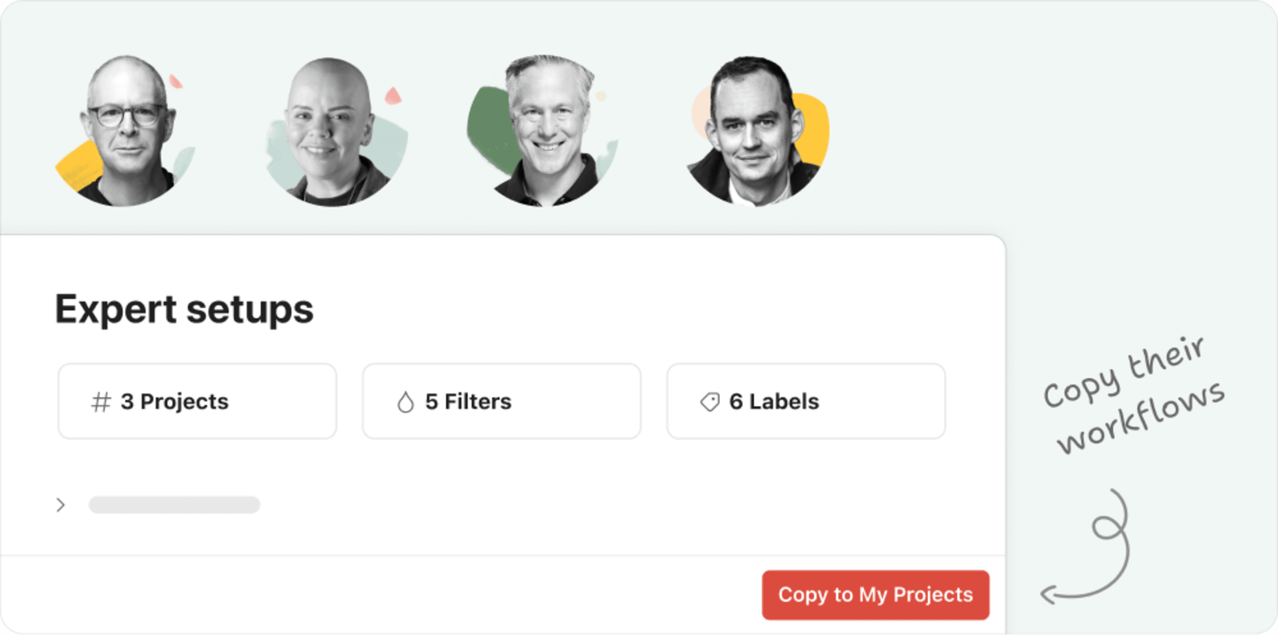
And now, with our newly-released crop of easy-to-copy Setups, we’re bringing our Ambassadors’ expertise right into Todoist!
With just a few clicks, they’ll help you turn an app into an approach, so you can feel confident that no matter what life throws at you, you’ve got a trusted system for handling it. 💪
This month’s featured Setups
Shared from some of our community’s favorite productivity experts, we’re excited to present:
- Carl Pullein’s Time Sector System setup will help you move from task-based to time-based thinking, and gain control in the process.
- Martine Ellis’ Wellbeing-Driven Productivity setup aims to help you thrive without sacrificing your own wellbeing, through a simple and holistic approach.
- Mike Williams’ Doing-to-Done setup provides a simple-but-powerful way to manage all the roles that make up your life’s story, so you can write your next chapter calm and in control.
- Peter Akkies’ Productivity 101 setup will help you use your time intentionally, so you can stay on top of all of your life’s responsibilities (instead of the other way around).
Each setup in the gallery includes an overview of the approach and a short video introduction, so you can get a quick sense if any might be a good match for your unique brain.
See one you’d like to try? Just click Copy setup, and you’ll have additional in-app guidance, a video walkthrough, and all the projects, filters, and labels you need already imported into your Todoist.
Quick tip
To access the Gallery from the app, just hit the + sign next to My Projects in the sidebar, or your team name if you have a team workspace. Select Browse templates to open the gallery. Click on the Setups category to see our whole collection, with more coming every week!
Of course, you can always adjust, customize, or remove anything you like – it’s your Todoist, after all! But if you’re feeling a bit overwhelmed – or just want a fresh start – committing to a new setup may be just the thing to put you back in the driver’s seat.
Note
Though copying these setups is a breeze, the standard limits for projects and filters still apply. Depending on your current usage, you may need a Pro or Business account to be able to import them. (Our expert setups are pretty comprehensive, so generally make extensive use of projects and filters.)
So if you’ve been looking for an excuse to upgrade, you may have just found it! With our expert setups in place, you’ll be well-positioned to get the maximum value from a paid subscription.
Week layout & Calendar integration: Jun 26
You probably have a pretty good idea of what tasks you want to get done each week. When it comes to actually getting things done, though, sometimes finding the time to make it all happen just... ain’t happening. 🙅
But, of course, tasks aren’t the only thing that fill up your days. Dentist appointments, team meetings, kids with colds. Creating a plan for the week that accounts for all of our commitments (and the curveballs along the way) is complicated business.
That’s why we’ve steadily been adding calendar views to every corner of Todoist. Tasks take time.
Today we’re sharing two new calendar features that, together, help you find the balance. The week layout and Calendar integration make it simple to create a clear, realistic plan for your tasks and your time.
Here’s Jon from the Product Marketing team to show you how they work. 👇
How it works
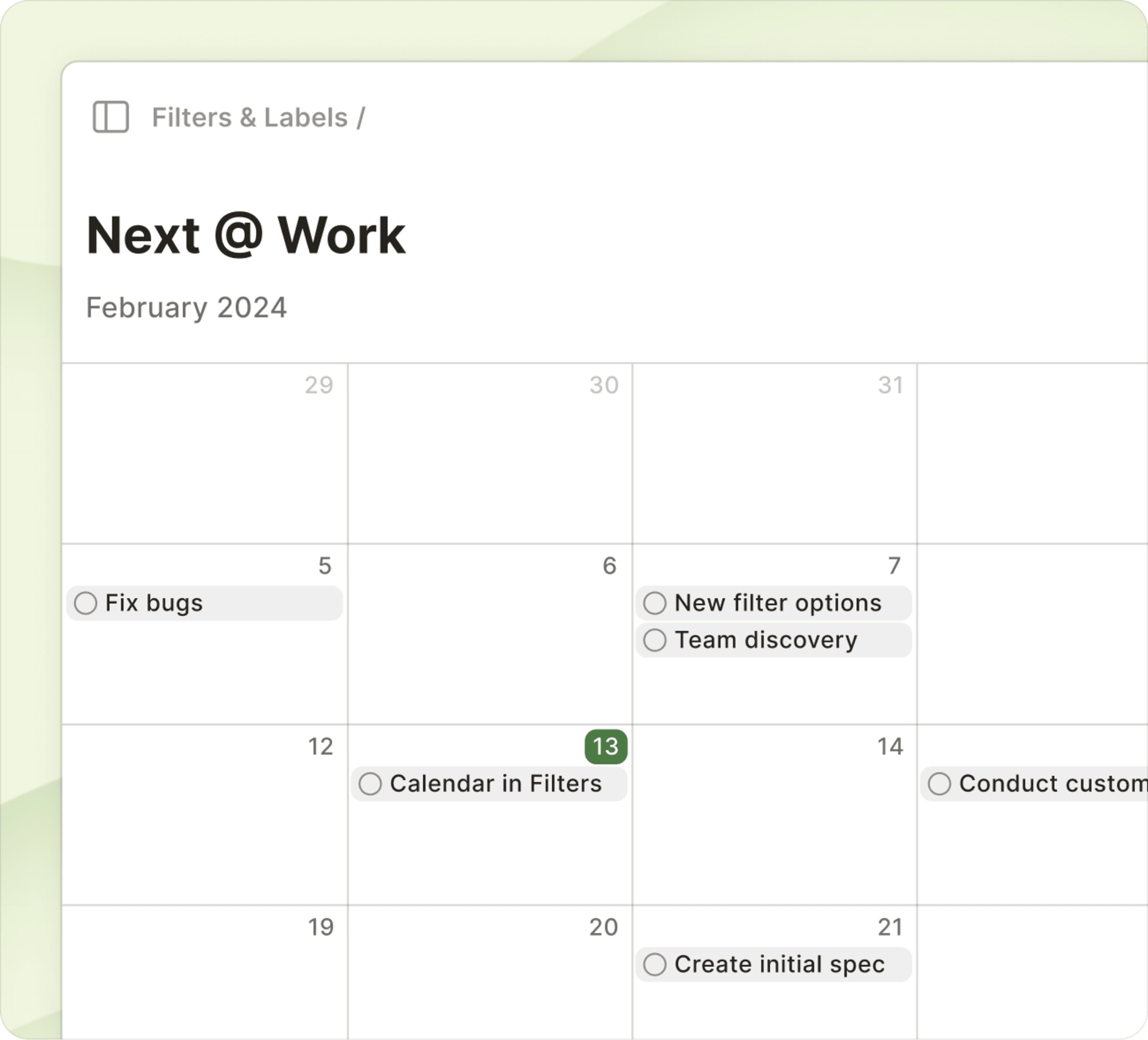
- The week layout is available on paid plans. You can use it in Upcoming, projects, filters, and labels. To enable it, open the View options menu. Click Calendar and select Week in the Layout toggle below.
- On paid plans, new multi-day layouts on Todoist for iOS and Android can be enabled in the View menu. On phones, there's a 3-Day option, while on iPad it’s a full 7-Day layout.
- The Calendar integration is available on all plans! To enable it, head to the new Calendars tab in Settings. From here, click Connect Google Calendar and follow the flow. Once enabled, you can toggle the visibility per-calendar associated with that account. Events are synced to Todoist for iOS and Android as well.
Hello, Time Blocking
The fine-grained timeline of the week layout unlocks the ability to create a time-blocked plan for your day. Click and drag to add a new time-blocked task. Move it around your schedule using drag-and-drop. Adjust how much time you plan to spend on them by dragging on the edges of a task.
It’s all about building a realistic plan for your week by allocating the time you need to get things done. 🧘♂️
At the beginning of the week, you might have a sense of which day a task needs to get done but not a specific time. These tasks appear in the All day section at the top of each day. When you sit down to plan a day, simply drag tasks into the timeline to build your agenda.
The new Calendar integration brings your external calendar commitments into the picture too, connecting with Google Calendar to sync a read-only version of events into Todoist.
In the week layout of Upcoming, events from your calendar are shown side-by-side with your tasks’ time blocks. This makes it simpler to find time for your tasks or adjust course when something new lands in the schedule. The same events will also be shown in the Today view for quick reference.
A new multi-day layout for Todoist on iOS and Android makes it easy to check-in on your plans and stay on track throughout the day. You can add new tasks with a tap, or make adjustments to your plan on the go by dragging and dropping tasks in the timeline.
Note
The new Calendar integration can’t be used while having the existing Google Calendar integration enabled at the same time. This is due to a limitation that would cause duplicate events to be created in Todoist. Learn more here about the differences between the two and get tips on how to decide which integration best fits your needs.
Bonus material
A lot of details went into this update that we didn’t mention above, but they are absolutely worth a look. 👀
- Events from the Calendar integration are also shown in-line in both the Today and Upcoming views when you use the list and board layout. This helps you judge your workload for the day.
- The sidebar on calendar views shows overdue tasks in Upcoming, and tasks with No date in other views, so you can make sure nothing slips through the cracks. 💪
- Tasks in the week layout are color-coded by priority and we’re exploring options to color-code by project next. 🌈
- Navigate quickly between weeks with the shortcuts
⇧→and⇧←, and back to Today withT. - Toggle to show/hide future occurrences of recurring tasks in the week layout.
- Clicking on events will open a link to the details in your calendar app.
- Support for more calendar providers to the Calendar integration (like Outlook and iCloud) is also on the roadmap!
Find the Setup that’s right for you: May 22
In case you missed it, the Templates squad has been hard at work on what you could call the next evolution of templates: Todoist Setups! Think of a Setup as a ready-to-go productivity flow that you can copy straight into your Todoist, just as easily as you would add a template.
You’ll get all the projects, filters, and labels you need to start using a productivity workflow, method, or system in just a few clicks (or taps – you can add a Setup on mobile, too).
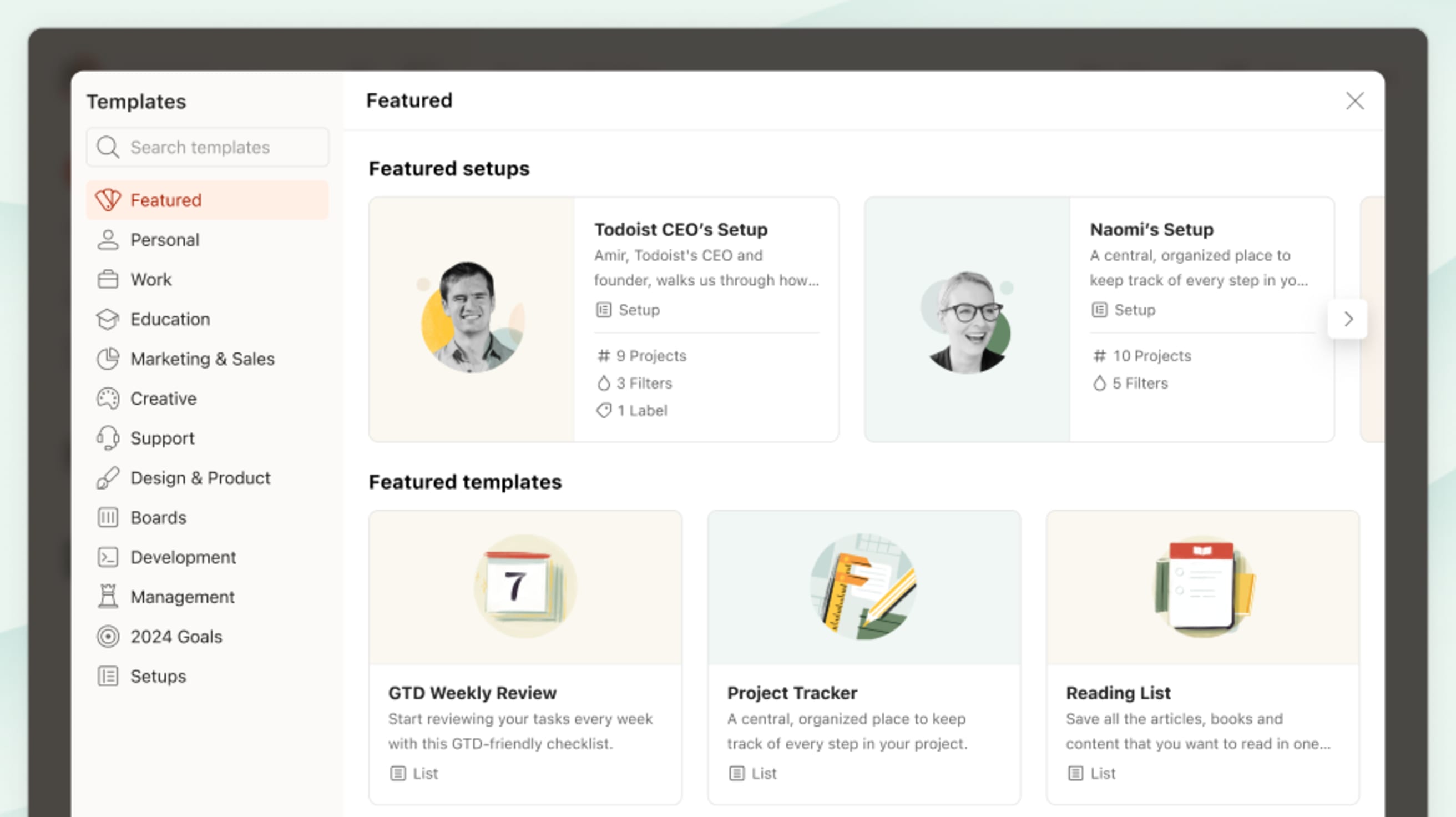
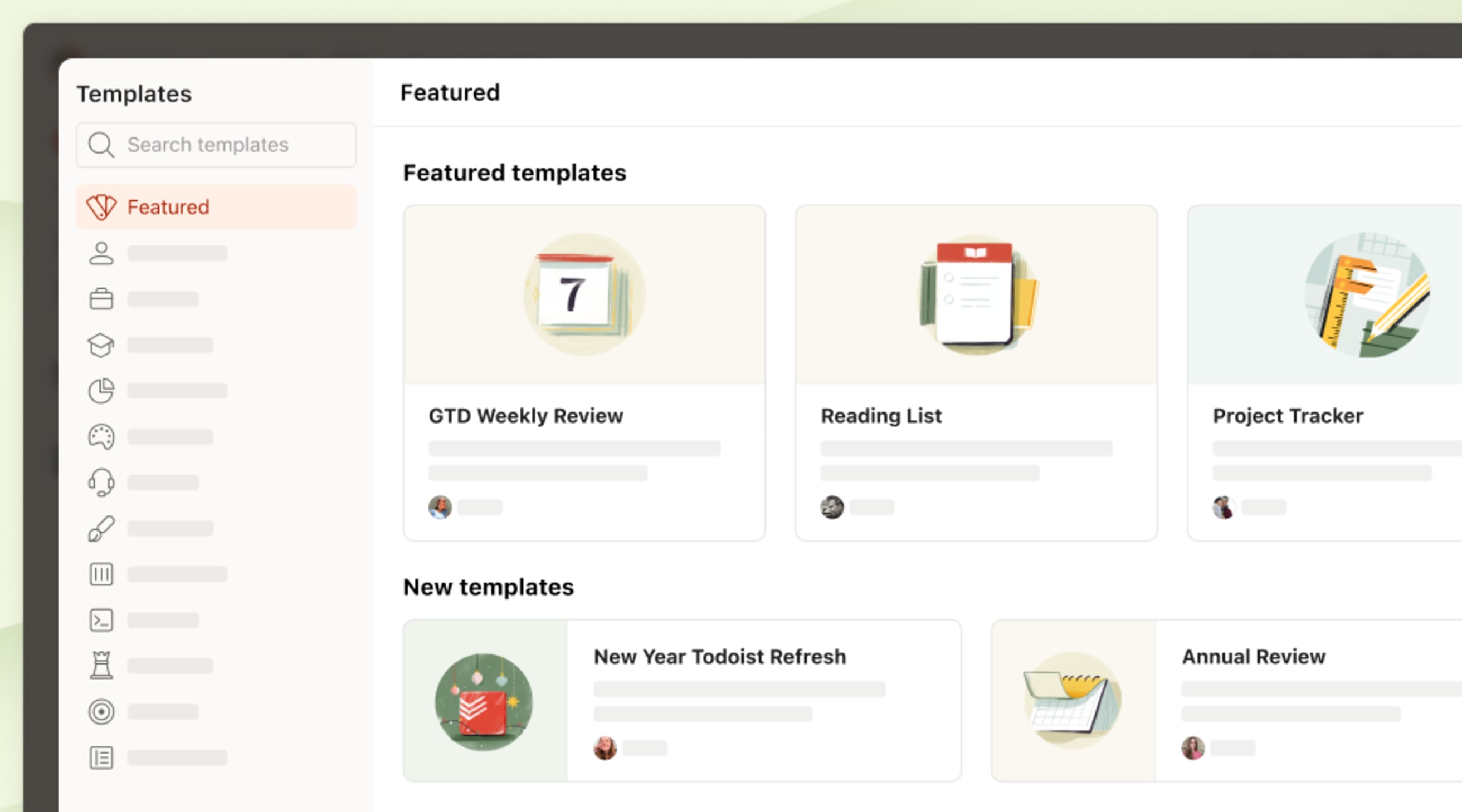
- You can find Setups in the templates gallery. In the sidebar (or navigation menu on mobile), hit the
+sign next to My Projects, or your team name if you have a team workspace. Select Browse templates to open the gallery. - Take a look at the featured Setups at the top or select the Setups category to see more.
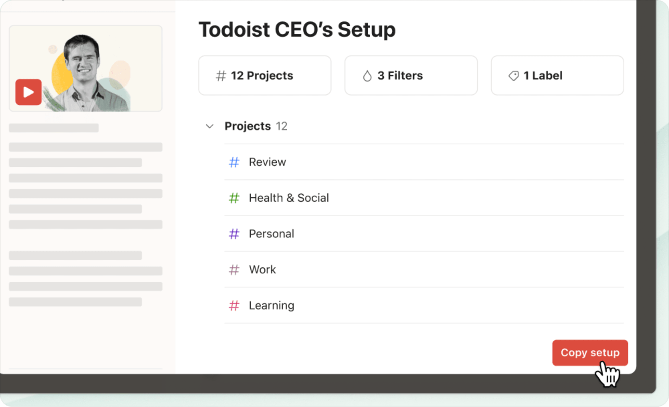
- Select a Setup to take a closer look at the projects, tasks, filters, and labels it contains.
- In the description, read About this setup or watch the video to learn more.
- Select Copy setup to import directly into your Todoist.
- You’ll find the imported projects, tasks, filters, and labels in your account, along with instructions to help you get started!
Our favorite Setups for the month
Not sure where to start? Here are 3 of our favorite Setups for the month:
Amir’s Setup – “I try to keep it as simple as possible: I only add actionable tasks I actually want to get done.” – Amir
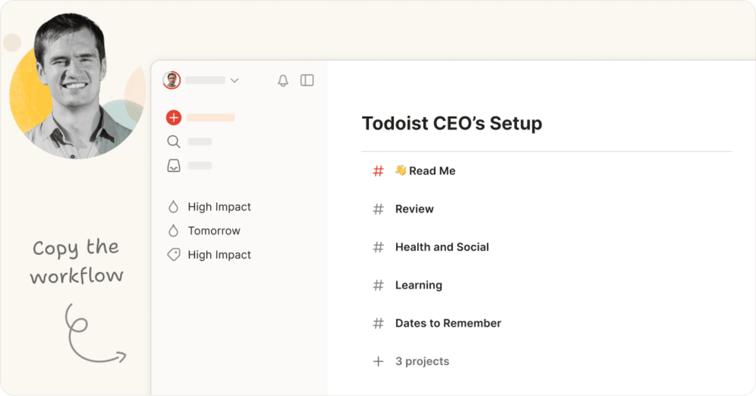
Todoist’s founder and CEO has been using this workflow (dubbed “Systemist”) for well over a decade to get things done without sacrificing time for himself and his family.
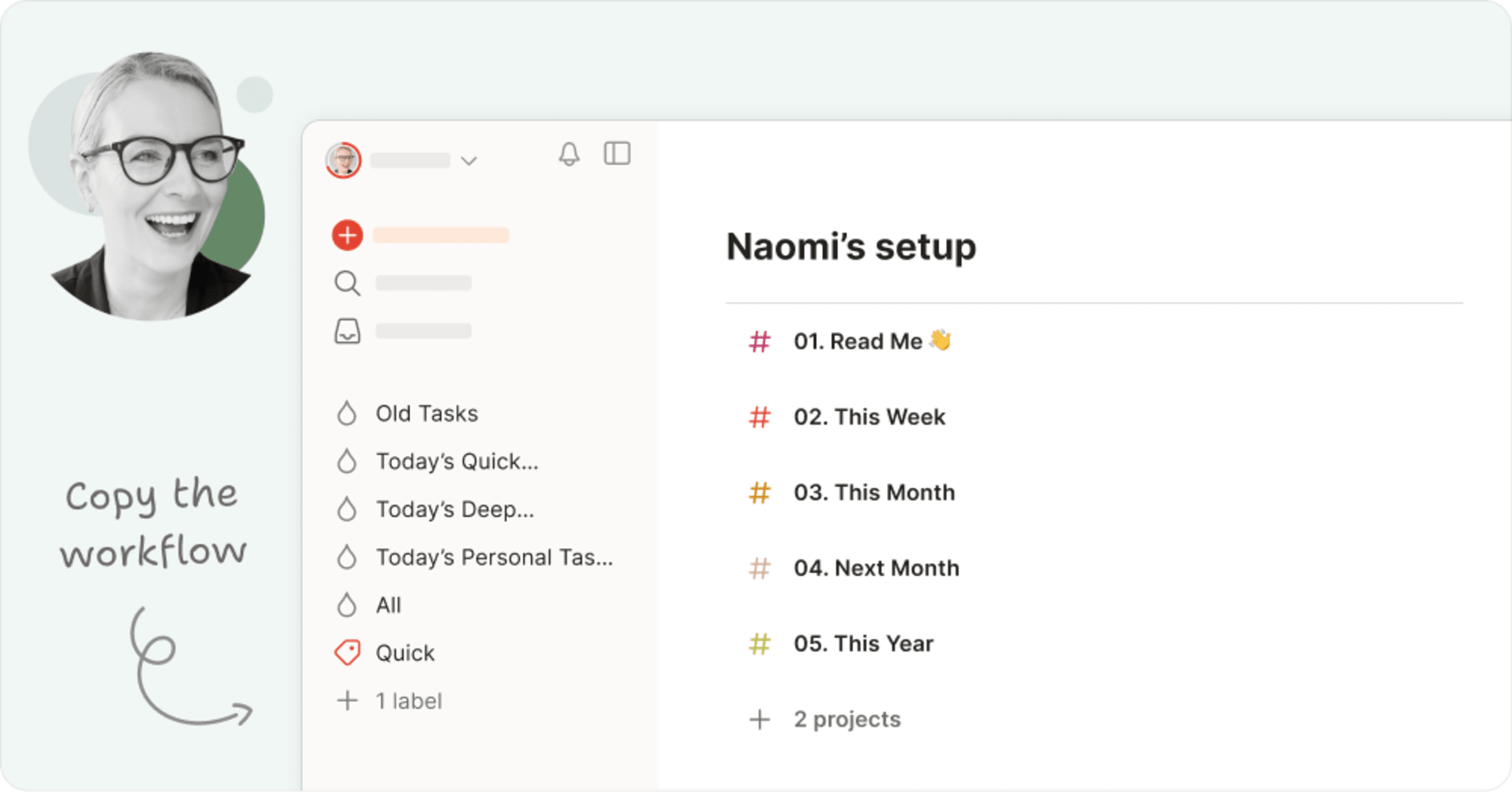
Naomi’s Setup – “It's somewhat unusual, but this setup has me feeling a lot less overwhelmed by my tasks.” – Naomi
If you’ve watched our YouTube channel, you’re familiar with our content strategist Naomi. Her unconventional Todoist setup (inspired by Todoist Ambassador Carl Pullein) is great for getting a picture of what you need to do in the short and long term, no matter how many tasks you’re juggling.
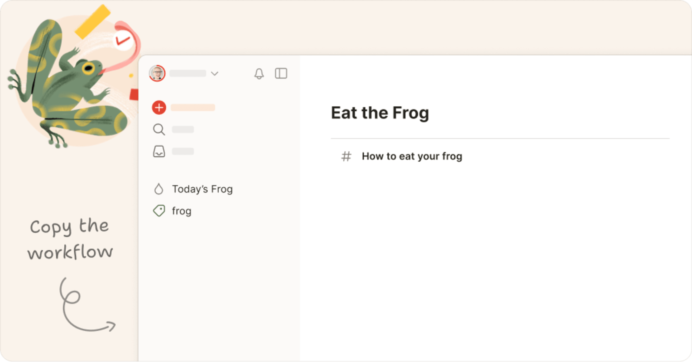
Eat the Frog Setup – “If it’s your job to eat a frog, it’s best to do it first thing in the morning.” – Mark Twain
Start each morning off right with this simple system to cut through the noise, break the procrastination habit, and make progress on what’s important every day.
Keep an eye on the in-app templates gallery for new Setups from our Todoist ambassadors in the coming weeks…
Quick tip
Not sure which Setup is right for you? Take our famous productivity method quiz to find out which method works best based on your unique strengths, challenges, and goals. We’re rolling out ready-to-download Setups for every productivity trick in the book, so you can dive right in and get going.
Remember, there’s no one “right” way to use Todoist.
Use these Setups as inspiration and a starting point, but don’t hesitate to add, remove, and mix and match elements to create a setup that’s just right for you.
A bundle of time-saving desktop upgrades for macOS, Windows & Linux: May 20
Great news for our desktop power users! Rui and Seva, our dynamic desktop duo, are laser-focused on refining our desktop apps to perfection. (Did you know Todoist is available for macOS, Windows, and Linux?) They’ve been making all sorts of subtle yet impactful upgrades, each contributing to a smoother, more intuitive experience with managing all your tasks and projects on your computer.
Some of last month’s highlights:
Launch at startup
You now have the option to set Todoist to launch automatically when you boot up your computer. Just head to Settings > Advanced and flip the ‘launch at startup’ toggle on (available for macOS & Windows users).
Quick navigation via your system tray or menu bar
It’s even easier to navigate Todoist with quick access shortcuts – just use the macOS menu bar or the system tray menu on Windows and Linux to leap to your favorite views in a snap.
A better global Quick Add, even while offline
Adding a task from anywhere is even more seamless now that the global Quick Add shortcut once again works without an internet connection. In addition to restoring offline capabilities, we also fixed an issue so that closing Quick Add using Ctrl/Cmd + W now works correctly without needing to restart the app.
Copy an entire workflow to your Todoist with Setups: Apr 23
Raise your hand if you’ve started organizing your Todoist setup, only to realize that you’re not getting anywhere in creating a productivity system that makes sense and can actually help you get things done. 🙋
We’ve lost those hours of trial and error too. While using Todoist is a great starting point for being more productive, having a system in place that helps you capture and organize your life is key to staying on top of everything.
That’s why we’ve created Setups. They allow you to copy a whole set of projects, filters, and labels to your Todoist, so you can get started with a productivity workflow right away. Now you can spend those hours of trial and error on getting what matters done, with the peace of mind that comes from knowing you have it all under control. (Or at least as under control as life can be. 😅)
Our Setups can help you start using a new workflow, like the Eat the Frog method or Systemist, our CEO Amir’s personal productivity method. You can also use Setups with your team just as easily as you add them to your personal Todoist. Use them as-is or customize them to fit your specific needs.
- In the sidebar (or navigation menu on mobile), click the
+sign next to My Projects, or your team name if you have a team workspace. - Choose Browse templates.
- You can check out the featured Setups on the main page or go to the Setups category in the sidebar.
- Select a Setup you’re interested in to see details on its projects, filters, and labels, along with instructions on how to best use it.
- If you’d like to import it, click Copy setup.
- Customize the project, filters, and labels as you see fit or get started right away!
What’s Next?
Next up is a feature that we’ve seen requested time and time (and time) again – user-generated templates. You’ll be able to easily create, save, and share templates that you’ve created, saving you or your team time and effort.
Note
Let us know what you think of all the changes we’ve made with our templates by taking our short survey!
Find templates right in the app: Mar 19
Todoist has always had project templates. But we have to admit, finding and actually using one was a bit of a process. Going from the app, to the templates gallery on our website, and back to the app to use the one you needed? Or, on the mobile app, not being able to get to the templates gallery at all? We had room for improvement.
So, we moved the templates gallery right into the app so you can start using one with a few clicks. No more back and forth between the app and our site. Just more time to start tackling your tasks. ✅
Some of you might have noticed the new in-app templates gallery we released a couple of weeks ago – now it’s gotten a fresh new look that makes it even easier to navigate.
Templates help you take on that blank project and get you up to speed fast so you can start getting things done. Whether you’re that person in your group project who ends up organizing everything (been there 🙃) or someone who’s breaking out in anxious hives at the very idea of planning your whole wedding (also been there 😅), you’re only a few clicks away from having all your tasks laid out for you.
They can also inspire you to use Todoist in a way you haven’t before. If you usually use Todoist to keep track of your team’s tasks at work, try one to help you detach from technology once you’re off the clock. Or if you use it to create lesson plans for your students, you can use a template to help you get back into reading for pleasure, too.
No matter what project you take on next, you can get started faster and focus on the important part – actually getting things done!
If you want to try one out, just do the following:
- In the sidebar (or navigation menu on mobile), click the
+sign next to My Projects, or your team name if you have a team workspace. - Choose Browse templates.
- Look for a template you’d like to use, either by browsing a category on the left side or searching in the search box.
- Select the template that you’d like to use to see the preview.
- If it works for you, click Copy to My Projects.
- Dive in!
What’s next?
A lot more with templates! Next are Setups, which let you copy whole workflows to your Todoist (more on that soon). We’re also working on curating templates from experts you trust to make the gallery even more impactful.
And we know that a lot of you have been asking about a more efficient way to save your own projects as templates – that’s coming your way, too.
Have you used a template? Let us know your thoughts!
Calendar layout for Upcoming tasks: Mar 13
First it came to projects. Then filters and labels. Today, we’re back with (maybe) the most requested piece of the calendar puzzle so far: Calendar in Upcoming!
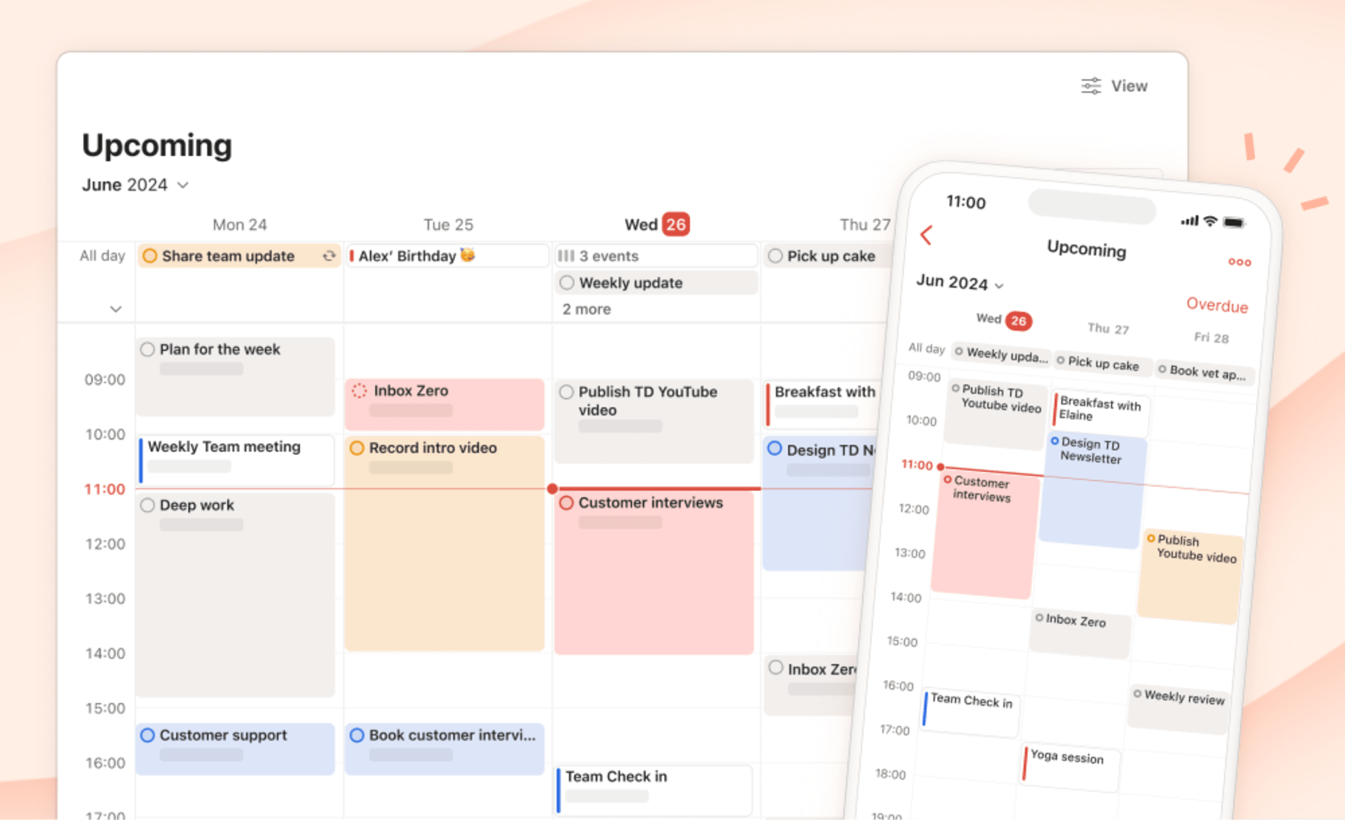
Upcoming is where tasks from every area of your life come together in a glorious melting pot of personal productivity. The new monthly calendar layout makes it even easier to plan ahead, balance your priorities, and ensure that no commitments sneak up on you.
- See all your scheduled tasks in a scrollable monthly view.
- Drag and drop between dates to reschedule tasks.
- Surface overdue tasks in a new sidebar and drag them onto the calendar to adjust your plans.
- On mobile, navigate faster with a new monthly view and Overdue task list.
Check out this short demo from Jon, a fresh face on the product marketing team, to see the new calendar view in action:
Here’s how to try it out for yourself:
On desktop
- First, ensure you’re on one of our paid plans.
- Select Upcoming from the sidebar.
- Click View in the upper right corner.
- Select Calendar, and all of your future tasks will be displayed in the new layout.
On mobile*
- Select Browse from the bottom navigation.
- Select Upcoming.
- Tap the month name at the top to expand the new multi-week calendar view.
- Use the
^to expand the Overdue section and see a full list of overdue tasks.
* The calendar in Upcoming will be rolled out to mobile throughout the next week.
Quick tip
Is your Upcoming calendar a little too full? In the View menu, you’ll see a few new filter options so you can show/hide tasks by priority level, label, assignee, or – if you use Todoist with your team – workspace. Seeing everything is great. Getting overwhelmed, not so much. ✌️
What’s next
Adding a calendar to Upcoming was a biiiiig milestone and we’re already working on the next step: a weekly calendar layout! We can’t wait to share it with you (and start using it ourselves 😇).
A small update to the mighty global Quick Add: Mar 13
The global Quick Add shortcut (Option ⌥ + Space ␣ on macOS or Ctrl + Space on Windows) is a powerhouse for capturing ideas and tasks the moment they strike. Use it to jot down tasks without breaking stride in your work – even if you’re in a different app. (Just make sure you have Todoist running in the background.)
Now, thanks to our engineers Rui and Seva, this beloved-but-little-known way of adding tasks to Todoist is even more seamless.
When entering a task via global Quick Add, feel free to click away – to copy text from a notes app or grab a pertinent link from your browser. The Quick Add bar will now stay open in the foreground waiting for you to paste the information right in.
Plus, Rui and Seva made the Quick Add bar fully draggable, so you can easily reposition it to a preferred spot on your screen.
When your German Head of Frontend calls global Quick Add “the most-used feature in his Todoist arsenal,” you know it’s a game-changer. Watch this short clip from Henning to see what he means:
A big thanks to all the desktop Todoisters out there who requested these improvements. Sometimes, it’s about adding exciting new stuff. But most of the time it’s about making the stuff we already have work that much smoother.
Quick tip
Don’t like the default shortcut? Go to your advanced settings to set your own custom shortcut for global Quick Add.
Todoist extensions come to team workspaces: Mar 13
Todoist extensions let you automate key actions and add new powers to your Todoist tasks and projects – like automatically creating follow-up tasks, adding a habit tracker to your recurring tasks, or getting a hand from AI to plan out your projects.
Now, you and your team can access Todoist extensions in your shared workspace, too! Here are 5 popular extensions you can try out today in your team tasks and projects:
-
Task Helper saves you the drudgery of performing tedious task actions over and over again by automating them. Use it to:
- Apply a task’s attributes (e.g., due dates, labels, priorities) to all its sub-tasks
- Create a follow-up task upon task completion
- Turn a task into an uncompletable task
Quick tip
Uncompletable tasks are especially handy for adding project notes and reference information at the top of team projects. Use the Task Helper extension to add this action to your task actions menu – or simply add an asterisk, then a space in front of any task name to remove the check circle.
- Habit Tracker challenges you to build consistent habits by keeping track of your recurring task completion streaks. If a recurring task becomes overdue, is postponed, or rescheduled to another day, the extension resets your streak.
- Conversation Starters automatically populates your meeting agenda project with random icebreaker questions so it’s easy – dare we say, fun? – to kick off the conversation.
- Export to Google Sheets lets you quickly create a progress report for any project that you can share with your boss or your team.
-
AI Assistant (available on the paid plans) helps you plan your projects, break down your tasks, and generally get unstuck when you’re not sure what to do next. Use it to:
- Get a suggested list of tasks for any project
- Get suggestions for the next step to complete a task
- Re-write tasks to make them more actionable
- Break down tasks into more manageable sub-tasks
- Sign into your Todoist account on Mac or Windows – or at todoist.com.
- Then click here to go to the Extensions Collection. (You can always find the collection again in the Integrations tab of your account settings.)
- Click on any extension to learn more about how it works.
- When you’re ready, click Add to add the extension to your Todoist.
Voilà! You’ll now see the extension as a new option in either your project actions menu in the top-right of any project or task actions menu in the top-right of any task details view.
Note
Extensions are available for our web and desktop apps for now.
Move projects out of your team workspace: Mar 13
In case you missed it, last month we launched the biggest collaborative update to Todoist since task comments: team workspaces.
We’re happy to report that team creators with admin rights can now drag team projects out of their team workspace and into their personal projects.
We know this limitation was incredibly frustrating – particularly for solo users who added a team out of curiosity. We so appreciate your feedback and patience as we implemented the simplest way to let you get your projects where they need to go while still guaranteeing data security for our team users.
Calendar layout for filters and labels: Feb 13
For the past six months, we’ve been adding stepping stones to bring a calendar layout to every part of Todoist. The latest, of course, was adding the calendar layout to projects. And we’re back today with another much-requested piece of the puzzle – calendar layout for filters and labels!
Many of you use your carefully curated custom views as a home base in Todoist. And, alliteration aside, that makes a lot of sense. Your work may be spread across projects (and workspaces!), but filters and labels make it simple to pull a very specific set of tasks into one lovely screen.
Here’s a few ideas to get you started:
- Label activities (like exercise or studying) and quickly visualize how often you make time for them each month.
- Filter for Work tasks and see the deadlines for all of your active projects in one place.
- Pull multiple projects into a single calendar and get an overview of your team’s workload for the month.
Filters and labels surface work from every corner of the app and are a great way to focus-in on the tasks that need your attention most. Using the new calendar layout to visualize these unique-to-you collections of tasks makes it easier to adjust your schedule and get your workload back in balance. And that’s what we’re all here for, right? 🧘
Quick tip
New to filters? Head to our Inspiration Hub for an intro to using filters and see real examples of how other people are using them to get more done.
Calendar-izing your filters and labels
First, ensure that you have either a Pro or Business subscription, and then:
- Select a filter or label.
- On desktop/web, click View in the upper right corner. If you’re on mobile, tap the three dots icon, then View.
- Select Calendar, and the list of tasks will automatically be displayed in calendar layout.
From here, you can do a whole lot:
- Get a bird’s eye view of key dates and milestones across projects.
- See conflicting deadlines coming.
- Quickly see what days you’re overloaded (or… unloaded?).
- Drag & drop scheduled tasks around the calendar to reschedule them.
- Drag & drop unscheduled tasks onto the calendar from the “No date” sidebar (on mobile, tap No date at the top-right).
- Click any date to schedule a new task.
- Navigate further in the future, or back in the past.
What’s next
Check out a short demo from our CEO, Amir, to see it in action and get a peek at what’s coming up (or should we say, upcoming 😙) for calendars in Todoist.
As we speak, Doisters are hammering out the details on the next installment to our parade of calendar layouts. If you’d like to be a part of testing out the latest and help us shape the future of Todoist, you might just be our next alpha tester. Welcome!
Effortless team invites with Team Discovery: Feb 7
It just got a helluva lot easier to gather your whole team in one Todoist workspace.
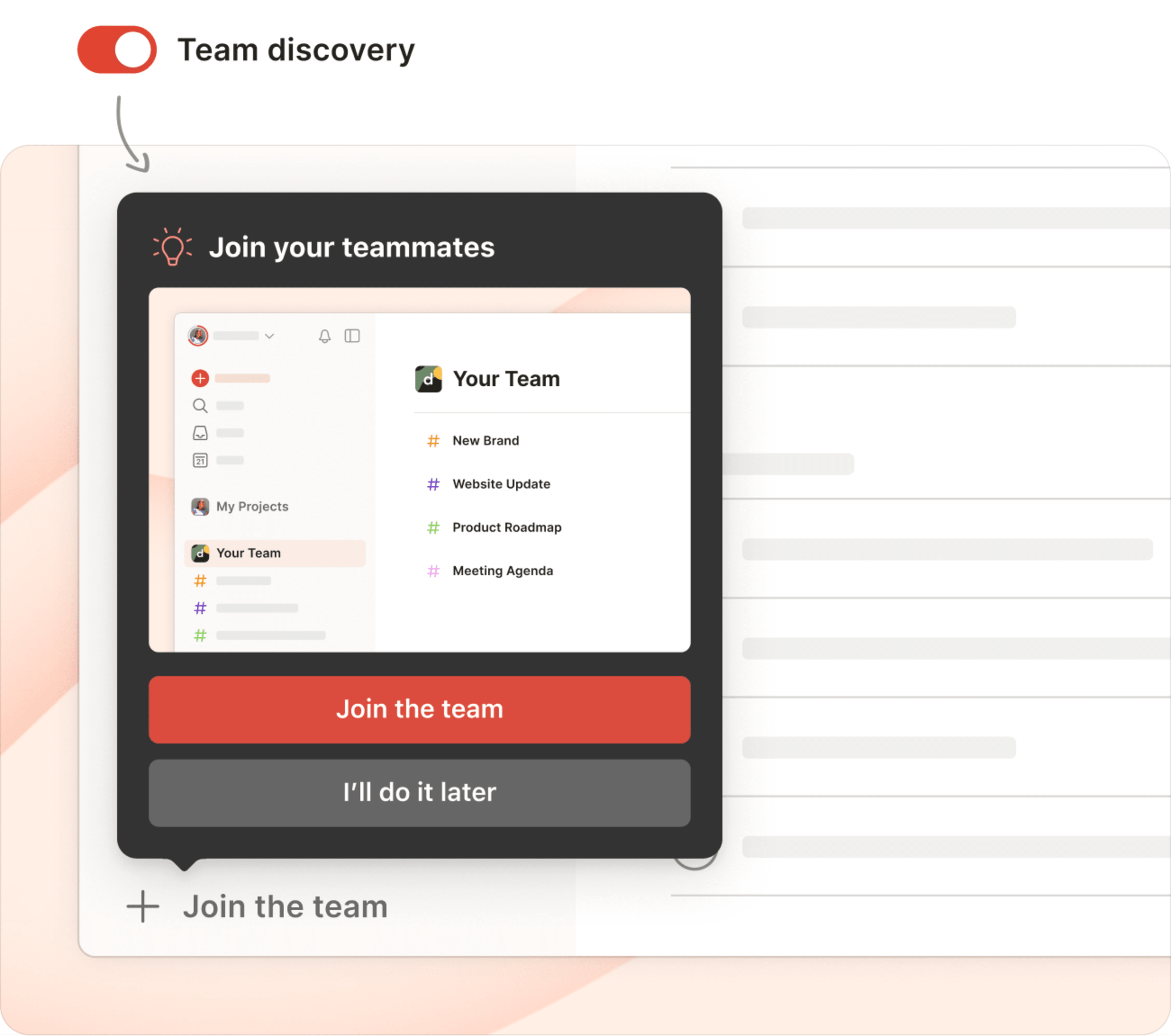
By turning on Team Discovery in team settings, admins can permit anyone with the same company email domain to automatically join their team. No other Todoist team can be linked with that email domain. And, when someone signs up for a Todoist account with a company email address, we’ll point them in the right direction.
No need to add each new member individually. No risk of multiple Todoist teams popping up at your company that you don’t even know about. And no possibility of lost teammates floating out in the Todoist universe all alone with no team to collaborate with.
Head over to the help center to learn more about Team Discovery and other security options for your team. Or – even better – take a look at this delightful demo from our very Italian developer Francesca 👇.
Filter by label, priority, or due date in any task view: Feb 7
Ever feel overwhelmed by the sheer amount of tasks on your plate? Thanks to new view filter options, you’ll have more granular control to focus on just the tasks you need right now and hide the rest for later.
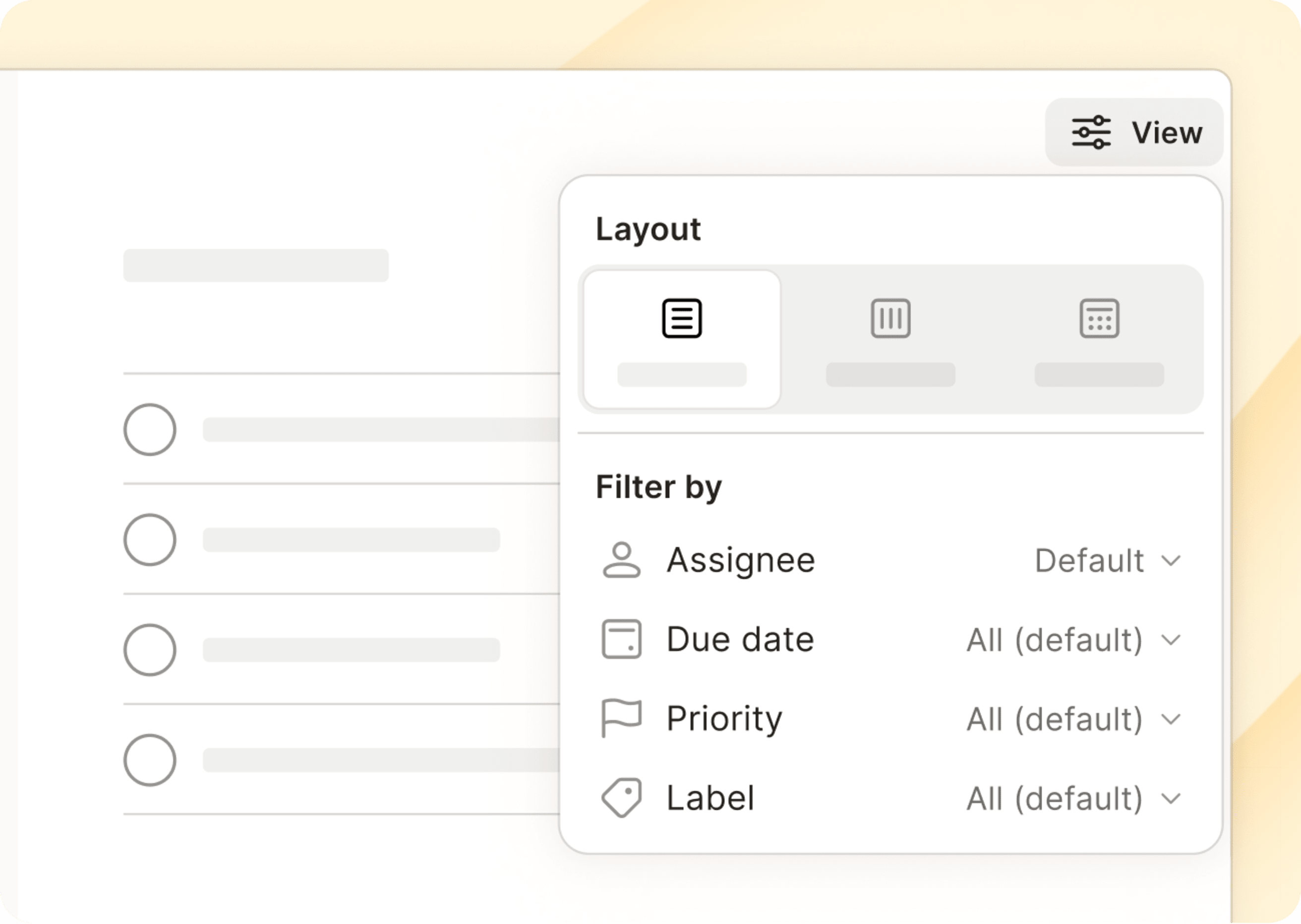
On top of filter by assignee (in shared projects) and filter by workspace (if you’re part of a Todoist team), you can now filter by:
- Label – Select one or more labels you want to see tasks of
- Priority – Decide which priorities you want to display
- Due date – Choose a time frame to only see tasks due within your selected period (e.g., today, this week, or the next 30 days)
These filter options are available in almost every task view in Todoist, no matter the layout: list, board, or calendar. Instead of perusing through a bunch of jumbled tasks, use them to narrow down the selection with methodical precision. Simply go to View at the top-right of any task view (via the three dots icon on mobile) and select from the list of available options under “filter by.”
Team workspaces: A shared home for your team’s work – Jan 17
From tech startups to law offices to construction crews, over 50,000 teams rely on Todoist to stay on top of shared work. But until now the only “feature” we had specifically designed for team collaboration was centralized billing. 🙃
We’re fixing that.
Team workspaces are a shared space to simplify and organize work together – alongside but separate from everyone’s personal tasks and projects.
Let our intrepid product manager Rain walk you through all that’s new for teams in Todoist:
Or scroll on for all the details...
Note
How team workspaces work
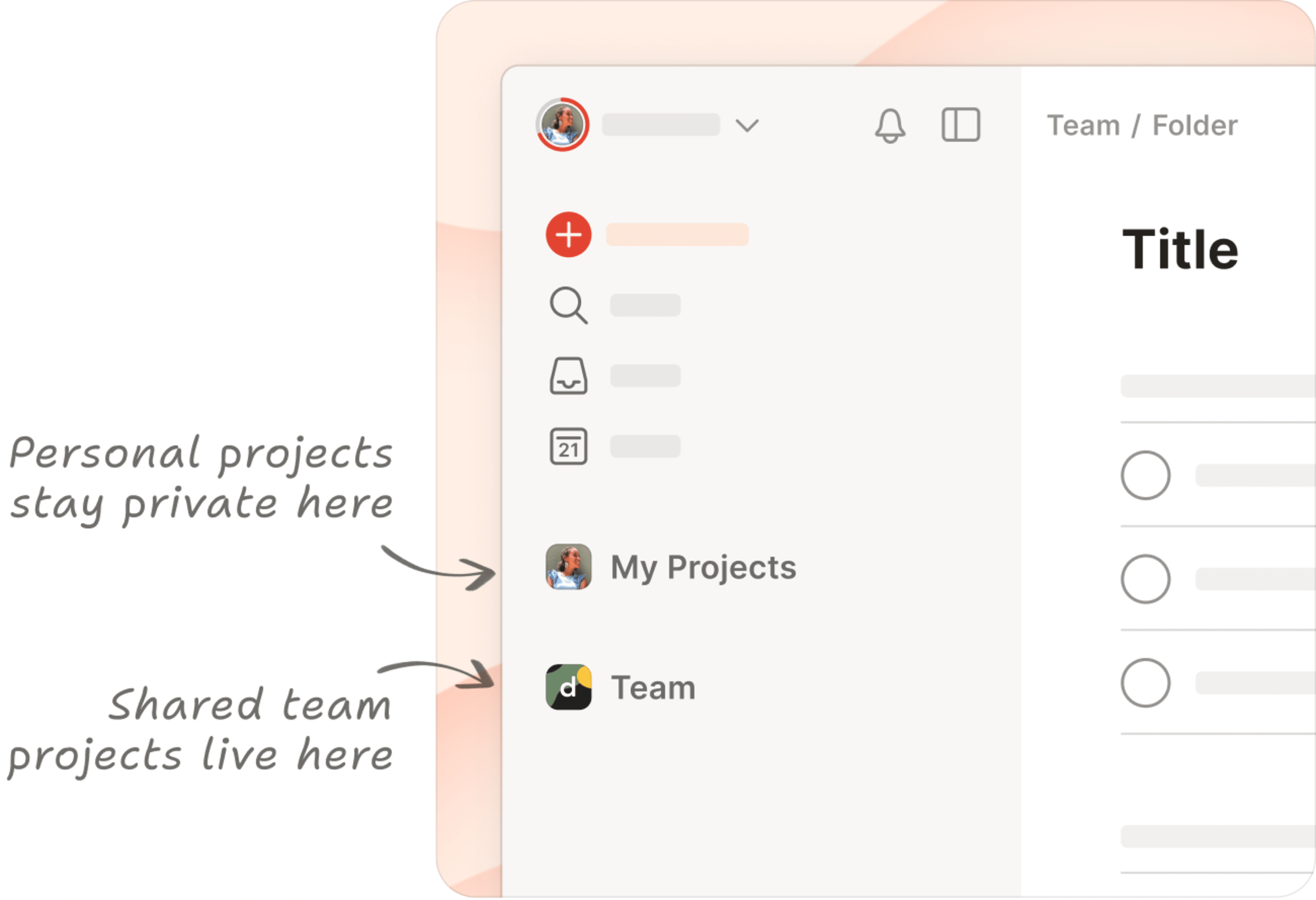
You can think of a workspace as a shared home for your team’s work that organizes team projects, tasks, members, and settings under the same roof.
- Team projects belong to the team and are accessible to everyone (unless they’re explicitly set to private).
- Personal projects (everything under “My Projects” in your sidebar) stay private and under your control.
As a team member, you’ll be able to:
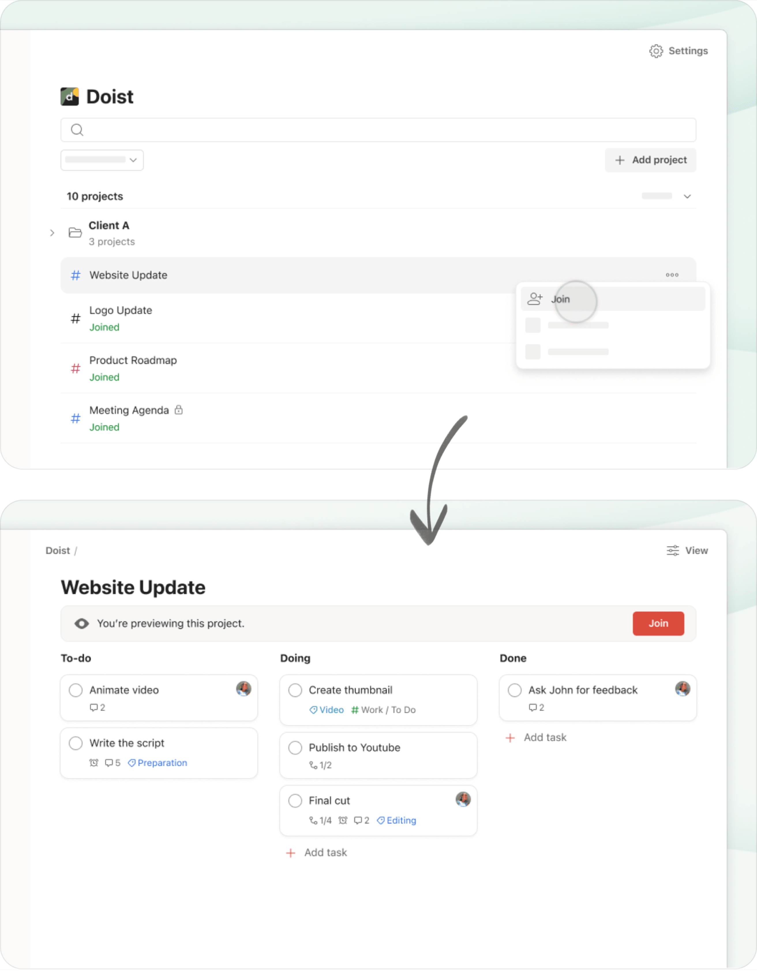
- Browse and preview public team projects and join just the ones that are relevant to you.
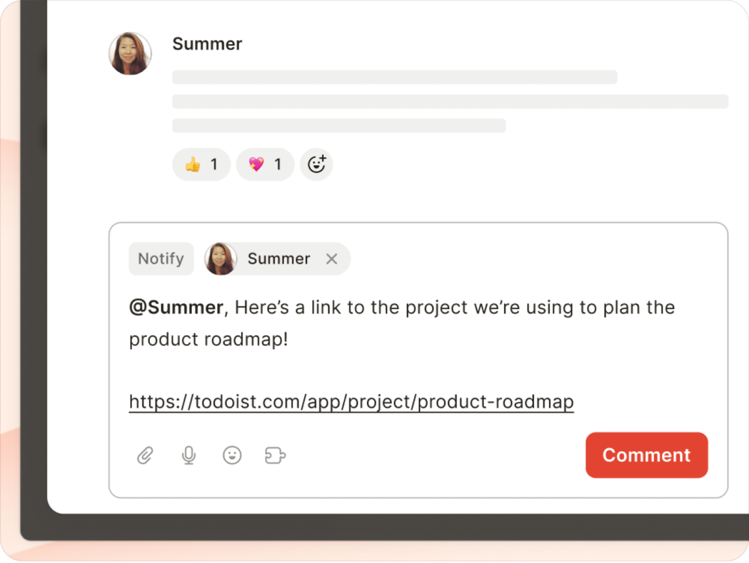
- Share direct links to projects, sections, tasks, and comments that your teammates can preview and instantly take action on.
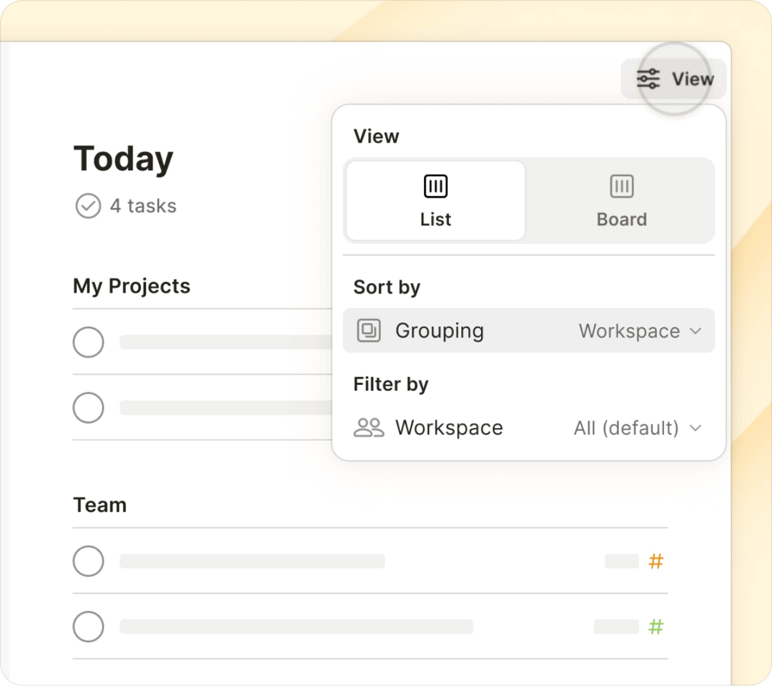
- Group or filter your tasks by personal and/or team projects from the View options menu in your Today, Upcoming, and filter views to better separate work and life.
For team leaders, adding a team to Todoist:
- Gives you a transparent, organized overview of all your team’s work and lets you pop in to see progress without having to join each and every individual project.
- Makes data ownership crystal clear. Team projects belong to the team. Personal projects belong to the individual.
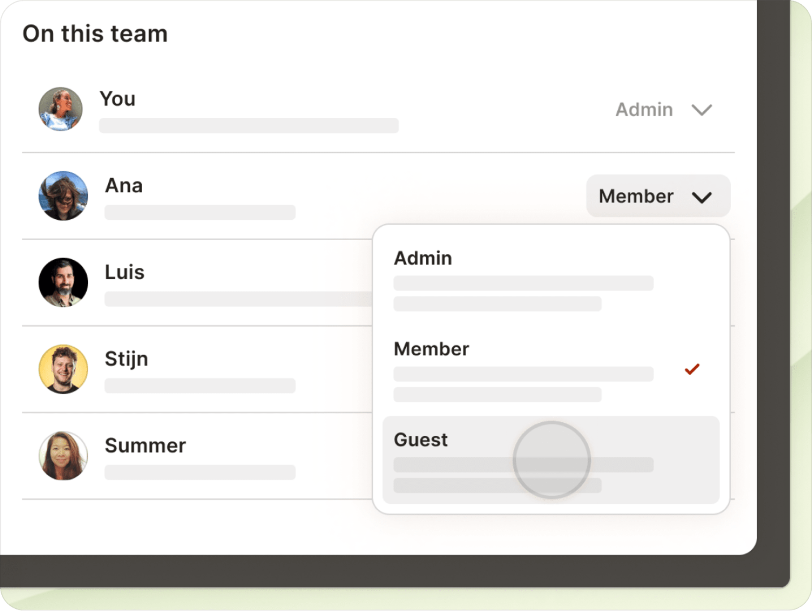
- Grants admins more control over permissions and data access in team settings.
Plus, when you upgrade your team to the Business plan, all members automatically get access to all personal Pro features – like reminders, calendar layout for projects, and task durations!
(After all, when your teammates are organized and on top of their personal to-dos, teamwork magically tends to flow more smoothly, too. 💆)
This update represents the next evolution of teamwork in Todoist, but we know there’s a lot more to improve. We’ll be leaning on your feedback to make sure we’re building the things you and your team actually need (without eroding what you already love about the app!).
Learn more about collaborating with your team in Todoist.
Or go ahead and add a team for free to try it out. Use the feedback button at the top of your team workspace to let us know what you think.
Note
Each team comes with 5 free projects. Upgrade to the Business plan as your needs grow.
Calendar layout for projects, and a happy new year! Dec 25
Before the year comes to a close, we have one very special announcement to unwrap: The long-awaited calendar layout is now available for projects!
Calendars have been a looong-requested feature and, throughout 2023, we’ve been methodically stacking the precise building blocks needed in order to build the calendar-everywhere-all-at-once view so many of you have been patiently waiting for.
The first building block was task duration, launched back in August. After that, we opted for an iterative approach to building calendars in Todoist – our first step being today’s release of calendar layout for projects. Since releasing this update to our experimental testers in November, we’ve learned a ton (900+ pieces of feedback and counting!) and, thanks to your insights, have added a few new elements to round out the experience.
Note
Calendar layout for projects is only available on Todoist’s paid plans.
Viewing a project as a calendar
Join Paweł, one of our frontend developers, as he walks you through the feature’s ins and outs from what can only be described as his North-Pole-adjacent office in Minnesota.
Try it for yourself! First, ensure that you have either a Pro or Business subscription, and then:
- Select a project with lots of tasks with due dates.
- On desktop/web, click View in the upper right corner. If you’re on mobile, tap the three dots icon, then View.
- Select Calendar, and the project will automatically be displayed in calendar layout.
From there you can:
- Get an overview of all your project’s key dates and milestones.
- Drag & drop scheduled tasks around the calendar to reschedule them.
- Drag & drop unscheduled tasks onto the calendar from the “No date” sidebar (on mobile, tap No date at the top-right).
- Click any date to schedule a new task.
- Navigate further in the future, or back in the past.
Some experimental testers have mentioned using calendar layout in projects for things like income tracking, as a content pipeline, and as a sleep tracker… Tweet us (X us? 🤔) @todoist to let us know how you’re using it!
What’s next for calendars in Todoist?
We know that calendar layout for projects doesn’t fully scratch the Santa-Clause-sized itch for calendar visualization in Todoist.
But please trust us when we say that it’s coming straight down the chimney pipeline! In 2024, we have a whole squad of Doisters dedicated to an initiative that’s internally referred to as “Calendar Everywhere.” 😏
We are very, very excited about this and if you are too, please consider signing up to become an alpha tester. That way, you’ll get access to our “Calendar Everywhere” explorations before the millions of others who use Todoist (including even our Experimentalists).
Thank you sincerely for all your support in 2023 – sending you all our very best and warmest wishes for 2024! 🎊
Freedom from the confines of default sorting logic: Dec 13
With the new manual sort option, you can rearrange your Today and Upcoming tasks any way you darn well please, thank you very much. 😤
Want to put a task scheduled for 9 AM at the bottom of a day’s list instead of at the top? That makes sense!
Want to drag a P1 task to the middle of your Today view? Who are we to say you shouldn’t!
Our “simple yet powerful” product philosophy means creating common sense defaults so most people don’t have to think about it most of the time…while giving you the option to override them when you need to.
After all, no two Todoisters are exactly alike. That’s what keeps our jobs so interesting!
Note
Please note that manual sort doesn’t work when you’ve applied grouping to your task view. Manual sorting in Upcoming is currently only available on web and desktop.
Today’s workload at a glance: Dec 13
Does it sometimes feel like you’ve scheduled 30 hours worth of tasks in a 24-hour day? It might be because you actually have. 😮💨
Now when you open your Today view, you’ll get a quick sense of your workload for the day with a total task count and the total amount of time you’ve planned for them based on cumulative task durations.
We hope this small change helps you better manage your workload and set ambitious but achievable expectations for yourself in 2024. Remember, there’s no shame in postponing for tomorrow that which you were never realistically going to get to today anyway. ¯\_(ツ)_/¯
Note
The task + time subtitle is exclusive to the Today view on the web and desktop apps for now, but we’re exploring ways to roll it out to other views (and mobile!) too – keep an eye out for future updates.
View filters and labels in board layout: Nov 30

As of November 30, 2023, boards have conquered the final frontier: filters and labels!
Imagine seeing…
- Your
#worktasksdue this monthneatly laid out in boards based on project. - Your
@waitingtasks cleanly arranged in boards based on the date you added them. - All the tasks
assigned by: mebeautifully visualized in boards based on the teammate you assigned them to.
Yes, you’ll still have the same number of tasks in your Todoist, and yet, the board layout somehow makes it all feel cleaner, calmer, and more manageable. (It’s science.)
Using board layout in filter and label views:
- Select the filter or label you want to see tasks of.
- In the top-right corner, click View (on mobile, tap the three dots icon and select View).
- Click or tap the Board icon to select the board layout.
- Group tasks by project, priority, label, or other attributes to see your filtered tasks arranged in columns.
- Filters containing multiple queries will group tasks according to each query by default.
Want to see it in action? Take a look at this short demo from our CEO, Amir.
A simplified layout for better focus: Nov 20
Nothing beats a clean, organized workspace. That’s why we set out to declutter Todoist and simplify the layout on all devices.
In the coming days, we’ll be rolling out Todoist’s new layout to all users. The cleaner look and feel will help you save your mental energy by focusing on what really counts – completing meaningful tasks and making the most of each day.
Find your way around the new layout 🗺️
The first thing you’ll probably notice is that we said goodbye to the beloved red (or your chosen theme color) bar at the top. The result is a more refined canvas, especially if you click the icon to hide the sidebar (or shortcut M).
Here’s an overview of what’s changed:
- Many items have been neatly tucked away into a new user menu that you can access by clicking on your profile picture.
- The ring around your profile picture will tell you how you’re progressing towards your daily completed tasks goal (if you’ve set one). Click on it to instantly see your completed task count at the top of the menu.
- We’ve removed the Home button, but rest assured, you can still change your Home view to whatever you like. Press the
Hkey on your keyboard to access it throughout the day. - And, never fear, you can still customize your sidebar in the new layout. Go to Settings > Sidebar to decide which views to show or hide.
- If you’re not a shortcut-kind-of-person, you’ll find Quick Add and Quick Find right near the top of the sidebar. (And if you are, go ahead and carry on using
QandCmd/Ctrl + K.) - Projects now have a new icon: mirroring how you would type
#for a project in Quick Add. - Should you ever feel lost, remember you can always use the
Cmd/Ctrl + Kshortcut to quickly find anything (tasks, projects, actions, and more) with our new Quick Find.
Quick tip
Head over to the new Todoist Bulletin for a deeper look behind the project. You can watch a conversation between Ben and Stephen, delving into the motivation and process for creating the new layout.
A new Todoist color palette 🎨
Of course, a new layout calls for some new colors! Designers Ana, Anaïs, Ben, and Stephen simplified the palette and created four new deliciously named color themes so you can make Todoist feel more like you (plus four more, if you’re on a paid plan ⭐).
Quick access with the navigation bar on mobile 📱
Developers Pedro and Enric implemented the new navigation bar at the bottom of the screen in our mobile apps. Here’s how it works:
- Use the bar to quickly navigate to commonly used views: Inbox, Today, Upcoming, Filters & Labels, or Search.
- Tap the Browse tab to navigate to any other view. Tap it twice to go straight to the navigation menu.
- Customize the navigation bar to fit your workflow by selecting the views you want quick access to. To adjust, go to Settings, then select Navigation on iOS or Navigation bar on Android.
Quick tip
 Now that we’ve decluttered the Todoist layout, you may feel inspired to tidy up your to-do list too. Check out our article on applying Marie Kondo’s life-changing tidying magic to Todoist. It’s the perfect step-by-step guide to help you organize and simplify your tasks for a productive, clutter-free experience.
Your feedback and ideas have been invaluable in guiding us through these enhancements and some tough decisions along the way. If you’re curious, we’ve shared some behind-the-scenes info on our new Todoist Bulletin.
Thanks for helping us build the tools you need for a more organized, productive, and clutter-free life. Let us know what you think of the newly simplified Todoist!
Faster loading, smoother scrolling with task list “virtualization”: Oct 13
Your long task lists will now load faster and scroll smoother with a nifty little update called list “virtualization”.
Instead of loading all tasks at once (slow), we now only load the items that are currently visible on your screen (faster). Scroll up or down, and Todoist smoothly loads the next set of visible tasks. (For the technically curious, here’s how our CEO Amir explains it.)
This is one of those almost invisible improvements that won’t make any headlines – in fact, the vast majority of Todoisters won’t consciously notice it. But these microsecond-saving upgrades all add up over time to an app that just works.
After all, you have better things to do than wait for your to-do list to load.
Keep track of progress with always-visible completed tasks: Oct 12
We’ve added a view option that allows you to keep completed tasks permanently visible within individual projects. It’s a great way to visualize your progress and recognize the work you’ve already put in.
To show completed tasks in a project, go to the View icon at the top-right and turn on the Completed tasks toggle. (On iOS, tap the three dots icon to show/hide completed tasks.) When enabled, the project’s “to-done” list will remain in plain sight across all devices and – for shared projects – between teammates.
Quickly switch project layouts with new menu design: Oct 5 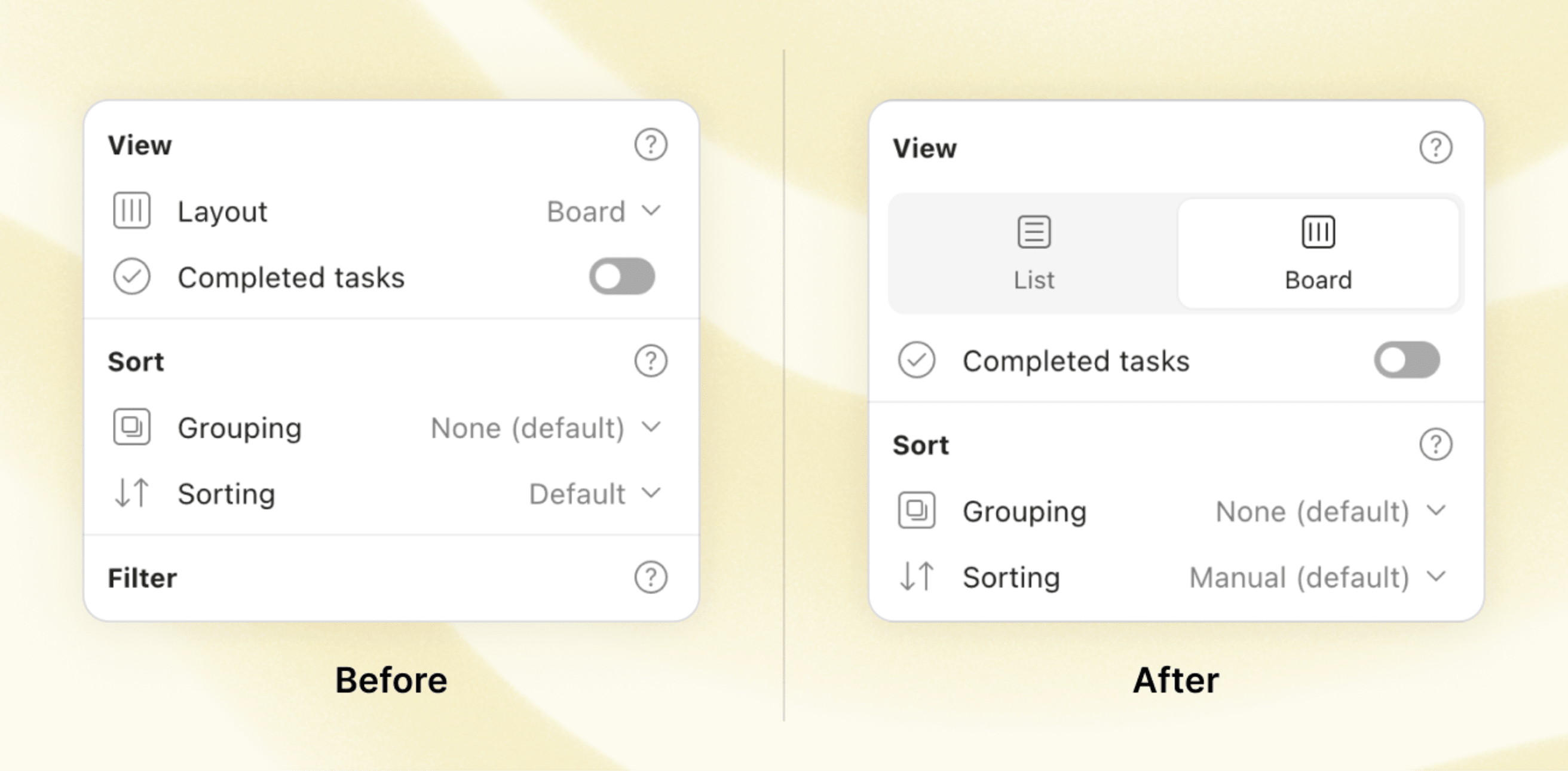
Changing the layout of your project is a lot quicker and simpler, thanks to the newly redesigned interface. It’s a small change, but by eliminating one click and adding clear and delightful icons, selecting a layout is more intuitive and almost requires no second thought.
Of course, you still have to decide between the options – list or board, what will it be?
Reclaim your schedule with task durations: Aug 30
Your to-do list can be infinite. Your time…not so much. By popular demand, we’re bringing task durations to Todoist to help you take back control over your schedule and craft a realistic plan for each day.
As one Todoister put it when she requested this feature:
“I am an intern at a law firm, a social activist, a student and, of course, I have many other duties in my life. To manage all that, I need to be able to control how much time I spend on each of my tasks in Todoist.”
By setting the time you’ll start a task and how long it will take, you’ll know exactly what will fit in your schedule — and what will just have to wait for another day.
Then, see your plan neatly blocked out in your calendar app of choice alongside your other commitments.
Note
⭐️ Task durations are only available on the Pro and Business plans. If you’ve been on the fence about upgrading your Todoist, now might be the time to finally make the investment in your productivity and peace of mind.
You’ll get full access to task durations plus our newly revamped reminders, 100MB of file uploads, our new AI-powered Filter Assistant, and more.
Every improvement we make to Todoist is 100% funded by subscriptions from users like you. We don’t sell user data, we don’t have ads, and we’re not beholden to outside investors. It just feels like a more honest way of doing business.
Here’s the nitty gritty on how to use task durations:
- When you click or tap on Time, you can now set the start time and assign a duration to your task.
- You can also add a task’s duration via Todoist’s signature smart Quick Add by typing “for” (e.g., “Team meeting today 4pm for 45min” or “Write first draft 9am for 2 hours 30 minutes”).
- If you’ve connected your Todoist to a calendar app, the task duration will sync to your calendar automatically (and, on Google Calendar, vice versa with 2-way sync so you can update your tasks from your calendar). More about using Todoist with your calendar.
Want to see it in action? Take a look at a short demo from Stijn, our product designer from the Netherlands:
Quick tip
Have you tried time blocking? It’s a simple, yet effective way to cut down on context switching and bring more control back to your workday. Find out how the time blocking method can work for you and how to implement it with task durations in Todoist.
A big thank you to everyone who wrote in to explain what you were missing in Todoist and what you wanted these features to help you accomplish. This update is a first step towards bringing more powerful planning tools to your Todoist… 👀
Take task durations for a spin and let us know what you think.
Turn off task goal celebrations: Aug 15
“For the love of god let me hide/disable the new cutesy pop up congratulating me on finishing some arbitrary number of tasks.”
We’ve heard similar sentiments from quite a few Todoisters that the celebration pop-ups when you complete your daily/weekly task goals are a bit too disruptive. Particularly on mobile.
We’re happy to report you can now turn off these pop-ups entirely from the Productivity tab in your Settings. 🙇
Multi-task drag & drop: Aug 3
Re-organizing your tasks just got a lot faster and much more intuitive with revamped drag & drop on Todoist’s web and desktop apps. You can now:
- Select and reorder multiple tasks within a project or section at the same time.
- Create sub-tasks in bulk by dragging them from left to right to adjust their indent level (or drop sub-tasks on top of their current parent task to turn them into regular tasks).
- Move multiple tasks to a different project by dragging them to the left sidebar.
- Know where you drop. We’ve added better visual indicators, so you know where exactly your tasks will land when dragging and dropping.
- Click and hold anywhere on a task to drag it. No need to find the little grey “handle” to the left of the task.
- Plus, reordering projects in the sidebar is now faster and smoother.
Want to see the new drag & drop in action? Take a look at this quick demo from Craig, our frontend developer from Vancouver, Canada, who single-handedly developed this feature:
Special character support for project, section, and label names: July 11
Previously, when you added special characters to the names of projects, sections, and labels, Todoist replaced them with an underscore. So your “Work @home” project would turn into “Work__home” project.
While many thought this was a pesky bug, it was actually because of technical limitations. (Long story short: characters like @ / # " ( ) | & , ! interfered with the functioning of Quick Add, search, and filters).
But now, thanks to some under-the-hood adjustments, these restrictions are a thing of the past. So you’re free to use all special characters in naming your projects, sections, and labels (with the exception of white space at the beginning or end of a name, which will be automatically trimmed).
Looking for creative names to personalize your to-do list? Here are some new personal favorites from Todoisters:
Add reminders fast with the new Quick Add shortcut “!”: Jul 5
Save yourself several clicks by typing “!” in the task field to add a reminder (or several) to your time-sensitive to-do’s.
Typing “!” — or tapping Reminders on mobile — will now pull up a quick list of suggested reminder times. Choose from the list, or keep typing your own.
Some example formats you can now use to set a reminder:
- !Mon 9am = Monday at 9 AM
- !2h30m = 2 hours and 30 minutes from now
- !30min before (or “!30mb” for short) = 30 minutes before your task is due (only works if your task has a due time)
- !later = 4 hours from now
- !tomorrow = the next day at 9 AM
- !next week = Monday at 9 AM (unless you’ve changed the default for “next week” in your Settings)
Go to our help center for a full list of Quick Add shortcuts for reminders in case you’re curious.
Quick tip
Add reminders to your recurring tasks, like “End of day review every day !every 5pm”.
A few other design updates to make setting reminders easier: Jul 5
While we were adding the reminder shortcut, we made a few other design updates to make the whole reminder experience clearer, faster, and more intuitive:
- The new menu on web/desktop allows for smoother date and time picking and the option to set a reminder for an amount of time before your task is due.
- Scheduled automatic reminders will now appear in your task details as soon as you add a due time (if you have automatic reminders turned on in Settings).
- Location reminders have been moved to a separate label for improved visibility. And, for even faster access, you can now place them front and center by customizing your Quick Add.
- An updated design on iOS with bigger map and adjustable radius for more precise location-setting for reminders.
- Enjoy a seamless experience across all platforms now that reminders on Android have been redesigned to look just as sleek as the rest.
Quick tip
Turn automatic reminders on to make sure you always get reminded of tasks with a due time. You can customize the default reminder time in Settings. Learn more
Create custom filters using natural language with Filter Assist: Jun 30
We’re the first to admit that figuring out the right query for your filter view can be a bit … complicated.
That’s why we set out to overhaul and vastly simplify creating a filter. This is with a little help from our AI overlords friends. 🤖
Before, you had to puzzle out a filter query that looked like this:
assigned to: me & due before: next month & #Work
Now, you can simply describe the filter you want using natural language, like this:
“all tasks that are assigned to me for this month in my Work project.”
The new, AI-powered Filter Assist will generate the filter query for you to add directly to your Todoist.
Want to see it in action? Take a look at a short demo from our founder, Amir:
Filter Assist is currently only available in English and Spanish. Learn more about Filter Assist at the help center.
Quick tip
Haven’t used filters yet? A few well-crafted filter views can go a long way in helping you focus on the right tasks at the right time. Here are 24 example filters Todoisters use to feel on top of their to-do lists.
Psst … Working on Reminders: Apr 25 🤫
Reminders are getting some much-needed love. Keep an eye out for a few exciting improvements coming very soon …
Of course, this is all still very hush-hush (well, most of it!), but we can tell you that reminders will look better and work even better real soon.
In the meantime, here are some smaller updates on reminders designed to help you remember the right tasks, at the right time, at the right place.
Pin reminders on Android 📌
Android users will be happy to hear that they now have the ability to “pin” reminders to their device’s notification panel. Accidentally dismissing a reminder will be a thing of the past. Head to your Settings and turn the Pin reminders toggle on to ensure crucial reminders will grab your attention when you need them.
More snooze options on iOS 💤
Things change, and sometimes a timely reminder is not what you need right now. On iOS, you now have more snooze options when you receive a reminder. To snooze a reminder, long press the notification on your device. Next to your default time for snoozing reminders, you can choose to snooze a reminder for 3 hours or even until 9 AM on the next day. Simply tap the desired snooze option, and get back to what you were working on in the first place.
Quick tip
You can change your default snooze time on mobile in Settings > Reminders > When Snoozed….
Improved reminder visualization (iOS) ✨
We’ve updated the design of reminder notifications on iOS, similar to what they already look like on Android. Now, the task name is placed front and center and the notification includes the reminder time. It’ll make interpreting reminders at a glance easier, so you don’t lose time deciphering them. Small change, big improvement!
Why am I not receiving reminders? 🤔
Figuring out how to set up your device to receive reminders can be tricky, so it’s no surprise that our number one frequently asked question is: “Why am I not receiving reminders?” We’ve got you covered with an updated Settings tab, in-app directions, and a new troubleshooting guide to help you set up your device for reminders.
Note
As we continue to improve the reminders feature, it would be great to receive your input on which functionalities you’d love to see most! Let us know through this short survey.
Focus on to-do, not overdue: Mar 31
We’ve all had our fair share of overdue tasks staring us in the face. They can be quite daunting, especially when they take over your view of the day as they pile up to panic-inducing levels. Here’s a quick fix: you can now collapse the Overdue section on your desktop or browser. 🤩
Perfect for whenever you feel overwhelmed or just need to focus on Today before dealing with those pesky or less important tasks.
The collapsible Overdue section is available in the Today and Upcoming view. Just make sure you’ve switched to list view and don’t have any grouping enabled.
So, go ahead and hide them for a moment of clarity, but don’t forget to tackle those tasks tomorrow, later in the week, or … someday, maybe. 🗓️
In other news, spring cleaning has started, and we’ve squashed a group of bugs making everything feel fresh and clean again. 🧹 ✨
- Your browser’s tab will now show the correct name of your label when you’re in a label view.
- Peek-a-boo! 🙈 The recurring circle icon seemed to be playing games in the task view of a recurring task. Playtime’s over, we fixed that bug.
- Long comments are displayed properly again.
- Some of you saw today’s tasks in the "Overdue" section of your Upcoming view. That’s not right, so we fixed that. What a relief, you’ve still got time! 😅
- Reset sub-tasks of a recurring task are now placed in the correct order.
- When you say “no date” or “no due date,” Todoist will know what you mean again.
- You can once again include comments when printing tasks.
- Want to delete a completed task? Go ahead, delete it! (Now that this pesky bug was eliminated.)
- When you add a video link in the comments, it will now show an image preview.
- Sometimes, the comment field wasn’t cleared after hitting the send icon. This has now been fixed.
- Checking the Upcoming view on your watch? Don’t worry, it will no longer show tasks assigned to others on your team.
- Completing a recurring task on your Apple watch will reset the task’s circle again.
- You can now also uncomplete a task from the task view.
- It’s great to get a notification when you receive a new comment. But, not so great if your device freezes after you close said comment. 😆 Luckily, that’s been solved.
- When you receive a reminder on Wear OS, you can directly reschedule the task again.
- Changing the date or due time may have resulted in some wonky behavior of the scheduler, but that won’t happen anymore.
- Adding a website as a task in Firefox will now successfully work for all websites, not just for some.
- Some fixes and design touch-ups to keep Todoist looking and acting refined. ✨
Will you help shape Todoist’s future of collaboration?✨
Do you regularly collaborate with others and believe that working together should be faster, simpler, and more joyful? Then you might be the perfect candidate to participate in our newest private beta. Sign up to be one of the first to test a brand new way of collaborating inside Todoist (before we release it to everyone else!).
Bye-bye bugs: Feb 8
It’s a new year and we’re off to a good start with a nice list of pesky bugs we got rid of. Also, some tuning and polishing have made everything a little better than before.
Customize Quick Add available on all platforms
With Quick Add customization now available on all devices, you can make Quick Add work even quicker for you. Personalize your Quick Add by choosing which task actions you want to display and in what order. Even better, your settings will automatically sync across all platforms.
For example, if your workflow includes regularly assigning tasks to your team members, you can choose to add Assignees to your Task Action list. Do you work with an intricate labeling system? Put it front and center so it’s the first thing you can add to your task. Think of this feature as a way to simplify and tailor your Quick Add to the way you work best.
- Do a little happy dance. 💃🕺 Each time you hit your targets with the new celebratory popups for reaching your daily and weekly goals (on web and desktop).
- Improved scrolling in Todoist for Wear OS when rotating the digital crown on your watch.
- If you use Todoist on Android, we can’t wait for you to reach #TodoistZero and see our new, delightfully moving animations to celebrate your success.
- On iOS, you can now long press the map to select the desired target location for your location reminder.
- Thought you were seeing double (again) when duplicates of the same task appeared? 👀 Don’t worry, it was just a bug and we squashed it!
- Uploading files to comments is working again.
- Quick Add on Safari won’t open the app anymore but will add a new task — quickly, as it should.
- Good news for those with slippery hands: the task view will no longer close when you click and accidentally drag the cursor outside the window.
- No more tricking you into thinking there are unread notifications when there are none. That bug was exterminated.
- Keyboard shortcuts were acting up and stopped working on every other task. That’s fixed, now they work on all the other tasks too.
- No more tricking you into thinking there are unread notifications when there are none. That bug was exterminated.
- Now your Apple Watch will always show the correct amount of tasks for the day. Glad we solved that math problem.
- If you have your language set to Korean, you’ll be happy to know that Quick Add recognizes natural language again. 🎉
- Stay on top of your to-dos again with widgets now showing up-to-date information.
- The app will now properly remember the default behavior you’ve set for resetting sub-tasks.
- Dragging and dropping the Dynamic Add Button will once again create a new task at the desired position.
- Tasks are now added to the correct section when board view is enabled.
- We got rid of some glitchy behavior of smart date recognition.
- The app will now open when you tap on the evening review notification.
- No more tricking you into thinking there are unread notifications when there are none. That bug was exterminated.

