When Apple released its Apple Watch, we knew that it was going to be an entirely new and exciting platform to adapt our app to. As a device that is literally strapped to our bodies, the Apple Watch allows us to have constant access to content and information.
But with these exciting possibilities came new challenges designing for a much smaller screen with limited interactions. We had to start from square one: to completely rethink the design and interactions of our app and create the best user experience possible. While coming up with solutions, we kept the core purpose of the watch in mind: brief, but frequent and important actions on the wrist. Apple Developer describes the foundations on which the Apple Watch was designed as:
- Lightweight interactions
- Holistic Design
- Personal communication
At first, testing our app was only possible on the simulator Apple provided to developers. While the simulator allowed us to experiment with some preliminary designs, we knew we needed to use the actual device to design the best user experience possible.
We needed to feel the frustration of holding up our arms 15 seconds longer than necessary because a key feature was buried. We needed to figure out through daily use what information and actions are essential and what are just nice to have. And we needed to experience what does and does not make information “glanceable” on a wrist.
To understand more about how we redesigned our initial concept after testing on the Apple Watch, here are the following ten lessons we learned:

1. The Simulator can’t replace real testing.
While the simulator was a great starting point, there are some key aspects of the watch it just couldn’t recreate.
First, just like with a smartphone, we are accustomed to using such a device with one or two hands. Interacting with it on a computer screen creates an entirely different feel and flow to the app. This left us blind to key aspects of the user experience.
Second, the watch is worn on your wrist, and it requires you to raise your arm to actively interact with it or to lift your wrist to access information. If you fiddle around with it for too long, though, your arm gets tired fast. So we thought quick interactions—the fewer the better—were key to offering the best user experience on this wearable device.
Finally, the watch itself has unique ways to interact with it that are very user friendly: the digital crown, force touch, and an entirely new home screen built specifically for the watch’s interface. After using these features on the actual watch, we better imagined the possibilities and incorporated them into the app’s design seamlessly.
2. Apple Watches are not mini-iPhones. Design accordingly.
In order to adapt Todoist to Apple Watch, we had to ask ourselves: what is the core purpose of a wearable device? How can these foundations be applied to Todoist for Apple Watch? Besides the aesthetics, what functionality should we incorporate into the watch and how can we make Todoist as useful as possible for a user’s productivity?
These questions led us to the conclusion that it would be best not to directly port the iPhone app UI on the watch. Instead, we wanted to rediscover the prime features of the app. We had to get rid of everything that was too complex to interact with, so that the watch app would only display information of immediate importance—for a day or even a moment.
Before deciding on an iteration, we always asked ourselves: is this simple enough? We iterated the process and relied on our assumptions, interpretations, and experience until we believed it was right.
Compared to other platforms, the Apple Watch has unique qualities. Our goal was to find those and adapt them to fit Todoist.
3. The glance view has to be completely 'glanceable.'

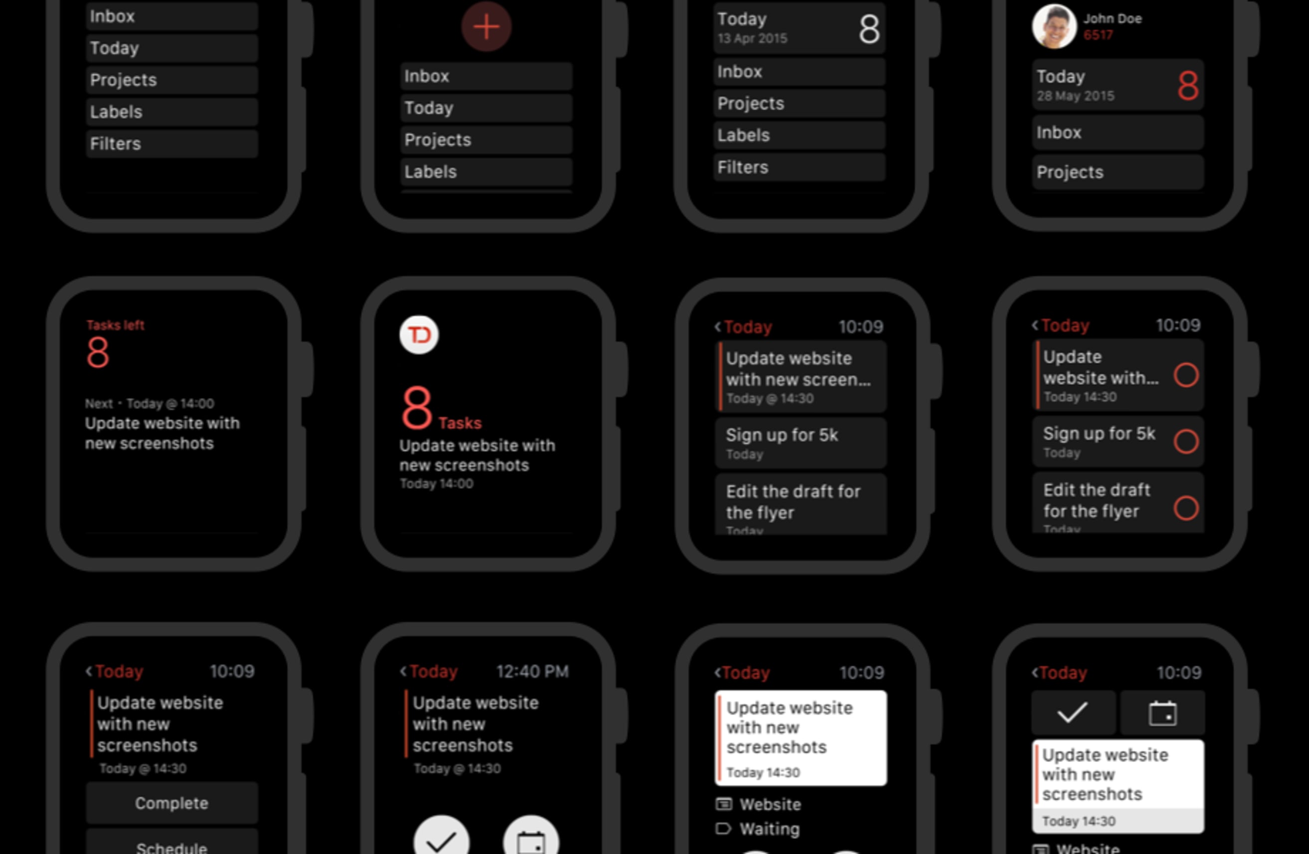
One screen that is unique to the Apple Watch is the glance view. “A glance is a focused interface that you use to display your app’s most important information,” according to Apple Developer. It’s a screen the user can access when swiping up on the watch face. It is meant to quickly display only the most important information. Todoist’s glance lets you see the number of tasks you have left as well as your next task.
We had a previous glance design that worked more or less. However, using it on the actual watch showed that there is still room to make more important information easier to view. When it comes to the glance view, milliseconds matter.
The new design of the glance now shows the number of tasks left much more prominently.
4. Nailing the Main View is critical.
After the glance, the Main View is the most important view in an Apple Watch app. It’s the first view you see when entering an app. After using our watches, we realized that if an interaction lasts beyond a few taps you’re likely going to reach for your phone. You just can’t hold your arm up for that long. For this reason, the Main View needed to provide easy access to the most important information and actions fast.
In our first attempt, we assigned every item the same importance. Since the app is used very briefly in the watch, we knew we had to set hierarchies. We experimented a little bit, and put the “Add Task” button at the top. However, this didn’t feel quite right.
The primary action in the app wasn’t adding tasks, but seeing the tasks the user has left for the day. So we restructured the layout and gave the “Today” button more importance. Now it is slightly bigger than the others, and the number of tasks is highlighted to make it more easily accessible. The hue of the number is eye-catching and separates itself from all the other elements, which is great for a quick glance on the watch.
At the top, the users can see the account with which they logged in and their Karma points. The inbox, projects, labels (Todoist Premium), and filters are now located underneath.

5. Force Touch is powerful. Use wisely.
One of the most powerful, unique features of the Apple Watch is Force Touch. Force Touch simply refers to firmly pressing on the screen. This action opens up a new menu depending on what screen you are in. After actually experiencing this feature, we realized that it had huge potential for adding efficient functionality while saving screen space.
We decided to implement Force Touch in our app to enable the user to add a task, no matter where they are within the app. This gives users a simple, fast way to get a task out of their head and onto their to-do list without wasting valuable screen space.

6. Compromises are unavoidable. Prioritize ruthlessly.
We quickly realized that the small screen size and limited interaction time meant that we would need to make hard decisions about which information and features should be prioritized.
Initially, we only showed a simple task list. If you wanted to interact with a task, you had to tap on it to show any actions. We discussed this several times and tried to decide what is more important: showing the task’s content or being able to quickly complete a task—which meant sacrificing the task’s information? We figured that taking the extra step to complete every task would be frustrating. For example, a user who wants to use Todoist while grocery shopping is just going to want to quickly check items off the list.
We decided to go with the option that would enable the user to complete a task more quickly. We added a checkbox next to the task. Users can still tap the task to open the detailed view and see more options like scheduling.

7. Important actions must stay above the scroll.
One of the other unique feature of the watch is scroll using the digital crown. It’s an awesome innovation that expands the amount of information users can access. However, we quickly realized that scrolling also slows down interaction.
When testing out our original task view concept, we found that placing buttons at the bottom was extremely inconvenient. For longer tasks, the primary actions were hidden, and the user would have to scroll. This would not have been very beneficial for the user experience. We decided to put the primary actions at the top to make them readily accessible. Users already know them from our mobile apps: Complete and Schedule. The date is slightly smaller, which supports the visual hierarchy of all the elements.

8. Use color and icons purposefully.
For the Apple Watch app, we wanted to reflect the look and feel of Todoist mobile apps and to keep its brand color and iconography. Not an easy task on a 38 millimeter watch face.
Our brand color is spread very subtly throughout the app and its icons, which were reworked specifically for the watch to ensure visibility as well as readability on the small screen. We also reused familiar symbols like the scheduling icons and redefined the stroke’s thickness to make sure they work well on the black background and that they have enough contrast.

9. Subtle animations, used sparingly, make for a delightful experience.
If done right, animations can enrich the user experience and the understanding of interactions. But as fun as they are to create, too many animations make for a slow and confusing app. This is true for other platforms of course, but it becomes even more important on the Apple Watch where fast, intuitive interactions are essential.
We ended up creating two customized apps. The first one is the interaction to complete a task. When tapping the checkbox next to the task, the box is filled in, the tick appears, and the task gets greyed out. This gives the user a visual cue that they’ve accomplished what they set out to do, allowing them to get out of the app more quickly. The second animation is the empty today view, an extremely important view. Here, we used the checkmark design that we already had on iOS.

10. Some of the things we want to do just aren’t possible...yet.
Of course, the Apple Watch still has limitations we had to work around, such as static images in the glance view, no swiping gestures, and only tap interactions. The fact that current third party apps can only be an extension of the iPhone means the performance isn’t nearly as fast as we’d like to make it.
However, Apple will soon be opening up exciting new possibilities for third party apps. The upcoming release of their new developer toolkit for the watch will make native apps possible. This will mean a much faster app that can take full advantage of the Apple Watch’s unique features like the taptic engine and complications, the small bits of information you can display right on the watch face.
As excited as we are about our first version of Todoist for Apple Watch, we can’t wait to keep innovating in the new space of wearable productivity. We’ll continue to look for the unique ways we can design and adapt our watch app to help users get their important tasks done with less time and effort. Stay tuned!

